class: center, middle, inverse, title-slide # Introduction to R ## Week 2: Making figures ### Louisa Smith ### July 20 - July 24 --- class: inverse, center, middle .hand-large[ Let's make our data... ] .larger[ beautiful ] --- # #goals .pull-left[ <img src="02-slides_files/figure-html/goals-plot-1-1.png" width="500px" height="500px" style="display: block; margin: auto;" /> ] .pull-right[ <img src="02-slides_files/figure-html/goals-plot-2-1.png" width="500px" height="500px" style="display: block; margin: auto;" /> ] --- # Basic structure of a ggplot ``` ggplot(data = {data}) + <geom>(aes(x = {xvar}, y = {yvar}, <characteristic> = {othvar}, ...), <characteristic> = "value", ...) + ... ``` .midi[ - `{data}`: must be a dataframe (or tibble!) - `{xvar}` and `{yvar}` are the names (unquoted) of the variables on the x- and y-axes - `{othvar}` is some other unquoted variable name that defines a grouping or other characteristic you want to map to an aesthetic - `<geom>`: the geometric feature you want to use; e.g., point (scatterplot), line, histogram, bar, etc. - `<characteristic>`: you can map `{othvar}` or a fixed `"value"` to any of a number of aesthetic features of the figure; e.g., color, shape, size, linetype, etc. - `"value"`: a fixed value that defines some characteristic of the figure; e.g., "red", 10, "dashed" - ... : there are numerous other options to discover! ] --- class:middle, center # ggplot builds figures by adding on pieces via a particular "*g*rammar of *g*raphics"  --- count: false .left-code[ ```r *ggplot(data = nlsy) ``` ] .right-plot[  ] --- count: false .left-code[ ```r ggplot(data = nlsy) + * geom_bar(aes(x = eyesight, * fill = factor(eyesight))) ``` ] .right-plot[  ] --- count: false .left-code[ ```r ggplot(data = nlsy) + geom_bar(aes(x = eyesight, fill = factor(eyesight))) + * facet_grid( * cols = vars(glasses), * labeller = labeller(glasses = c( * "0" = "Doesn't wear glasses", * "1" = "Wears glasses/contacts"))) ``` ] .right-plot[  ] --- count: false .left-code[ ```r ggplot(data = nlsy) + geom_bar(aes(x = eyesight, fill = factor(eyesight))) + facet_grid( cols = vars(glasses), labeller = labeller(glasses = c( "0" = "Doesn't wear glasses", "1" = "Wears glasses/contacts"))) + * scale_fill_brewer(palette = "Spectral", * direction = -1) ``` ] .right-plot[  ] --- count: false .left-code[ ```r ggplot(data = nlsy) + geom_bar(aes(x = eyesight, fill = factor(eyesight))) + facet_grid( cols = vars(glasses), labeller = labeller(glasses = c( "0" = "Doesn't wear glasses", "1" = "Wears glasses/contacts"))) + scale_fill_brewer(palette = "Spectral", direction = -1) + * scale_x_continuous( * labels = c("Excellent", "Very Good", * "Good", "Fair", "Poor"), * breaks = c(1, 2, 3, 4, 5)) ``` ] .right-plot[ 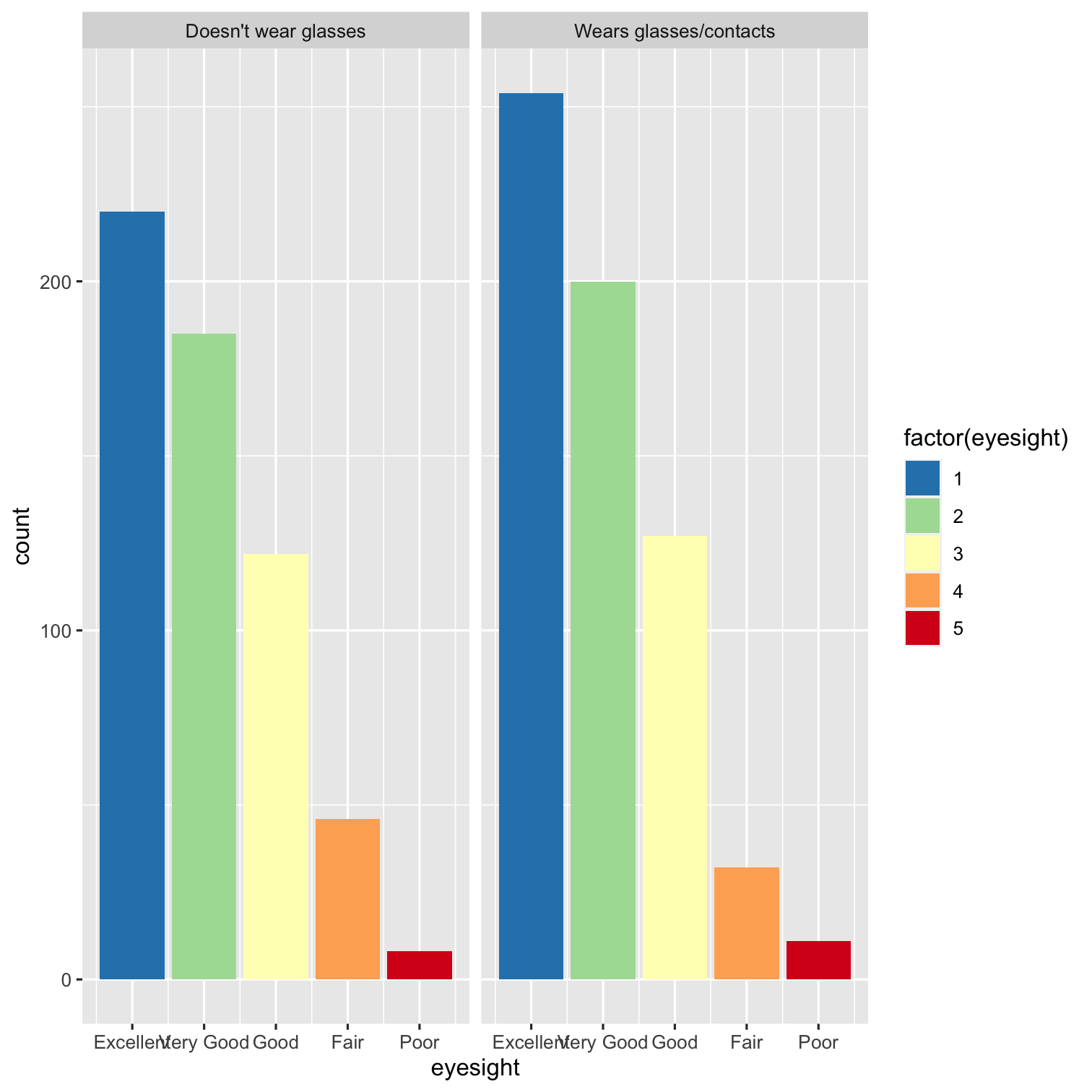 ] --- count: false .left-code[ ```r ggplot(data = nlsy) + geom_bar(aes(x = eyesight, fill = factor(eyesight))) + facet_grid( cols = vars(glasses), labeller = labeller(glasses = c( "0" = "Doesn't wear glasses", "1" = "Wears glasses/contacts"))) + scale_fill_brewer(palette = "Spectral", direction = -1) + scale_x_continuous( labels = c("Excellent", "Very Good", "Good", "Fair", "Poor"), breaks = c(1, 2, 3, 4, 5)) + * theme_minimal() ``` ] .right-plot[ 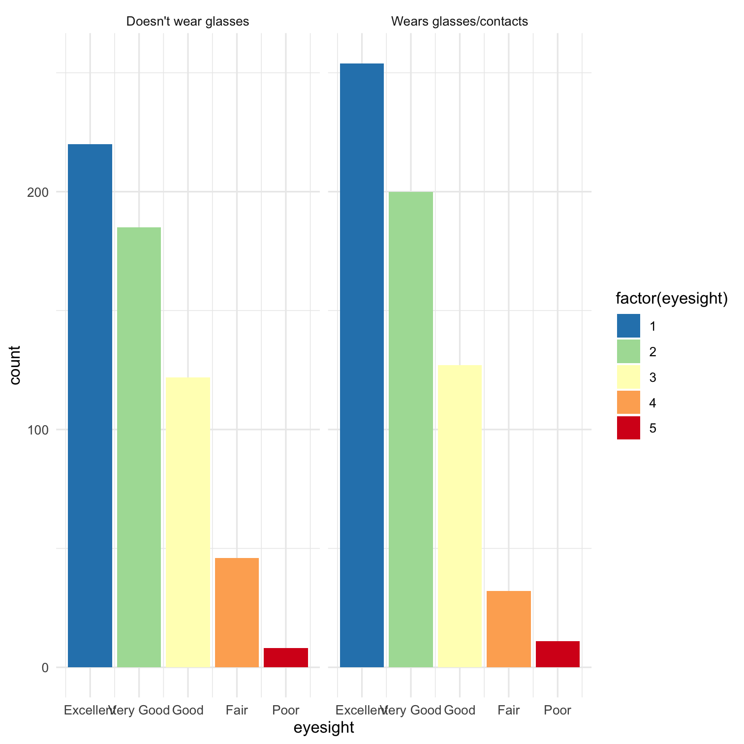 ] --- count: false .left-code[ ```r ggplot(data = nlsy) + geom_bar(aes(x = eyesight, fill = factor(eyesight))) + facet_grid( cols = vars(glasses), labeller = labeller(glasses = c( "0" = "Doesn't wear glasses", "1" = "Wears glasses/contacts"))) + scale_fill_brewer(palette = "Spectral", direction = -1) + scale_x_continuous( labels = c("Excellent", "Very Good", "Good", "Fair", "Poor"), breaks = c(1, 2, 3, 4, 5)) + theme_minimal() + * theme(legend.position = "none", * axis.text.x = element_text( * angle = 45, vjust = 1, hjust = 1) * ) ``` ] .right-plot[ 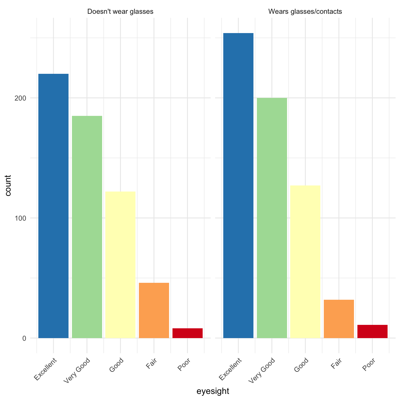 ] --- count: false .left-code[ ```r ggplot(data = nlsy) + geom_bar(aes(x = eyesight, fill = factor(eyesight))) + facet_grid( cols = vars(glasses), labeller = labeller(glasses = c( "0" = "Doesn't wear glasses", "1" = "Wears glasses/contacts"))) + scale_fill_brewer(palette = "Spectral", direction = -1) + scale_x_continuous( labels = c("Excellent", "Very Good", "Good", "Fair", "Poor"), breaks = c(1, 2, 3, 4, 5)) + theme_minimal() + theme(legend.position = "none", axis.text.x = element_text( angle = 45, vjust = 1, hjust = 1) ) + * labs(title = "Eyesight in NLSY", * x = "Eyesight quality", * y = NULL) ``` ] .right-plot[ 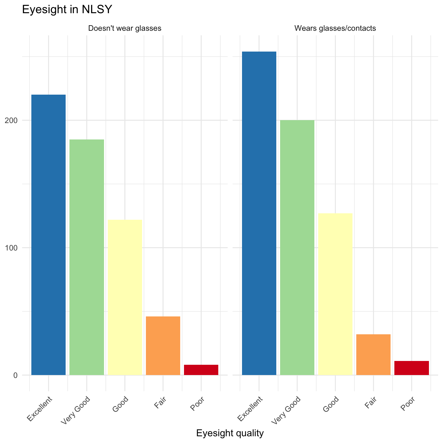 ] --- count: false .left-code[ ```r ggplot(data = nlsy) + geom_bar(aes(x = eyesight, fill = factor(eyesight))) + facet_grid( cols = vars(glasses), labeller = labeller(glasses = c( "0" = "Doesn't wear glasses", "1" = "Wears glasses/contacts"))) + scale_fill_brewer(palette = "Spectral", direction = -1) + scale_x_continuous( labels = c("Excellent", "Very Good", "Good", "Fair", "Poor"), breaks = c(1, 2, 3, 4, 5)) + theme_minimal() + theme(legend.position = "none", axis.text.x = element_text( angle = 45, vjust = 1, hjust = 1) ) + labs(title = "Eyesight in NLSY", x = "Eyesight quality", y = NULL) + * coord_cartesian(expand = FALSE) ``` ] .right-plot[ 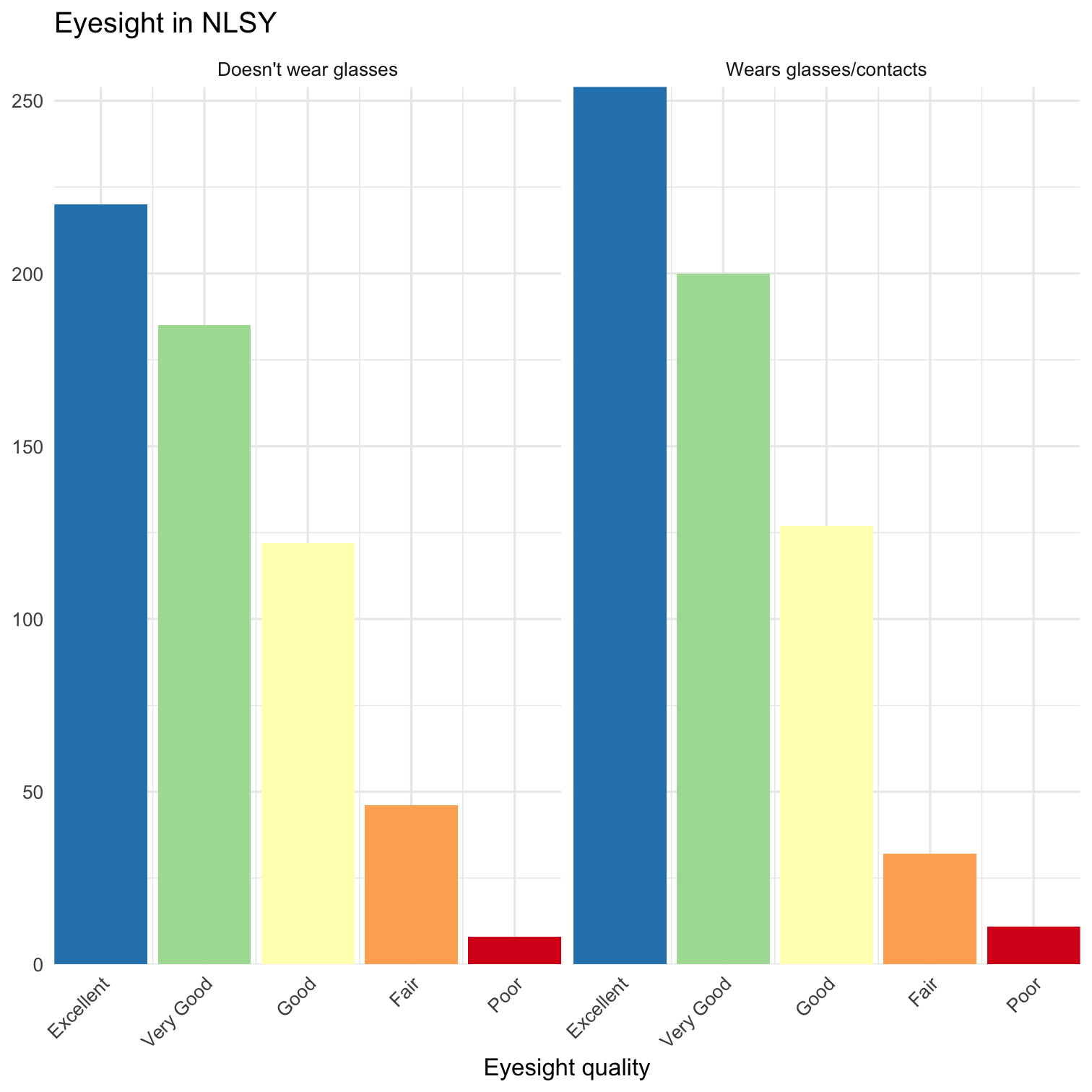 ] --- count: false .left-code[ ```r *ggplot(data = nlsy, aes(x = income, * y = age_bir, col = factor(sex)) *) ``` ] .right-plot[  ] --- count: false .left-code[ ```r ggplot(data = nlsy, aes(x = income, y = age_bir, col = factor(sex)) ) + * geom_point(alpha = 0.1) ``` ] .right-plot[  ] --- count: false .left-code[ ```r ggplot(data = nlsy, aes(x = income, y = age_bir, col = factor(sex)) ) + geom_point(alpha = 0.1) + * scale_color_brewer(palette = "Set1", * name = "Sex", * labels = c("Male", "Female")) ``` ] .right-plot[  ] --- count: false .left-code[ ```r ggplot(data = nlsy, aes(x = income, y = age_bir, col = factor(sex)) ) + geom_point(alpha = 0.1) + scale_color_brewer(palette = "Set1", name = "Sex", labels = c("Male", "Female")) + * scale_x_log10(labels = * scales::dollar) ``` ] .right-plot[ 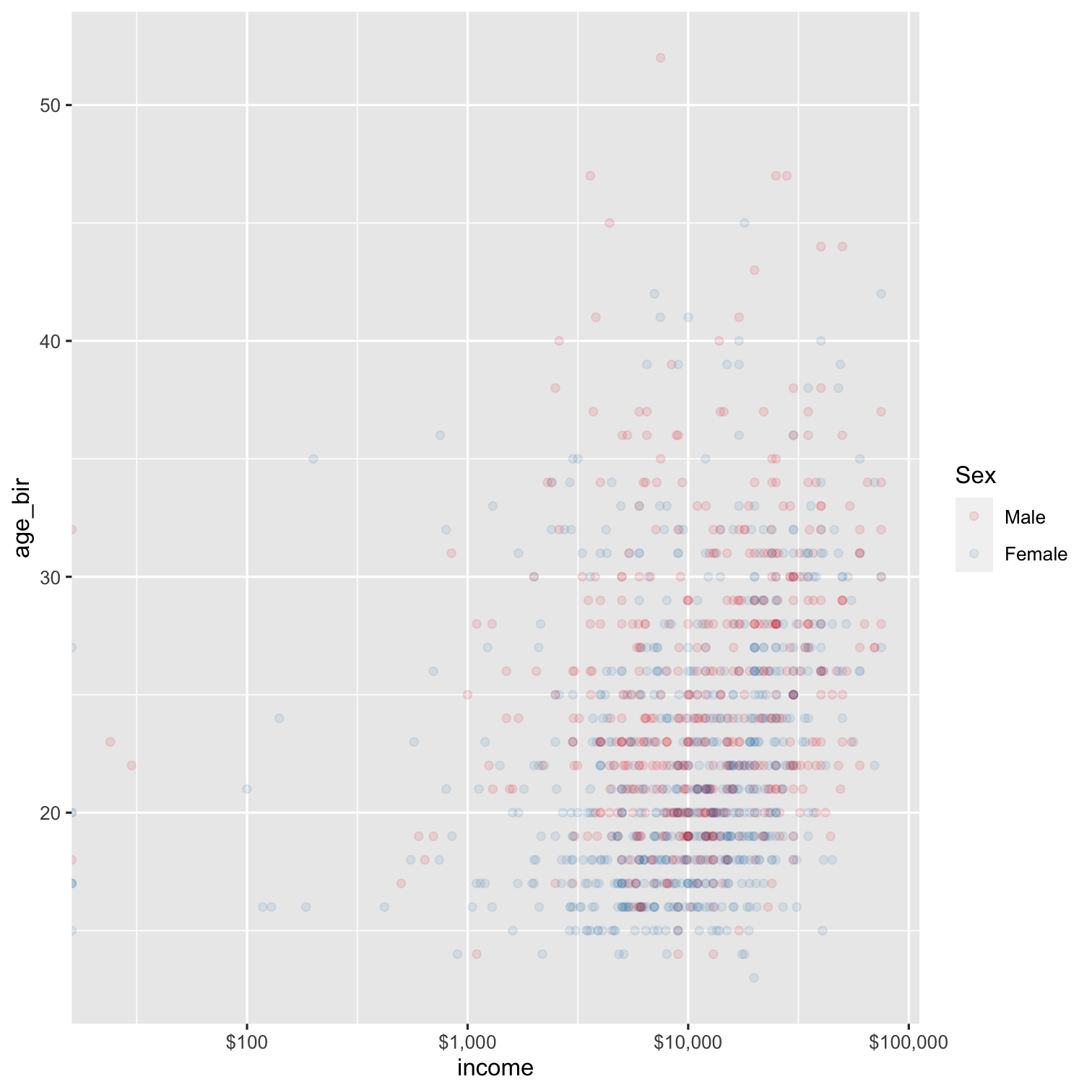 ] --- count: false .left-code[ ```r ggplot(data = nlsy, aes(x = income, y = age_bir, col = factor(sex)) ) + geom_point(alpha = 0.1) + scale_color_brewer(palette = "Set1", name = "Sex", labels = c("Male", "Female")) + scale_x_log10(labels = scales::dollar) + * geom_smooth(aes( * group = factor(sex)), * method = "lm") ``` ] .right-plot[ 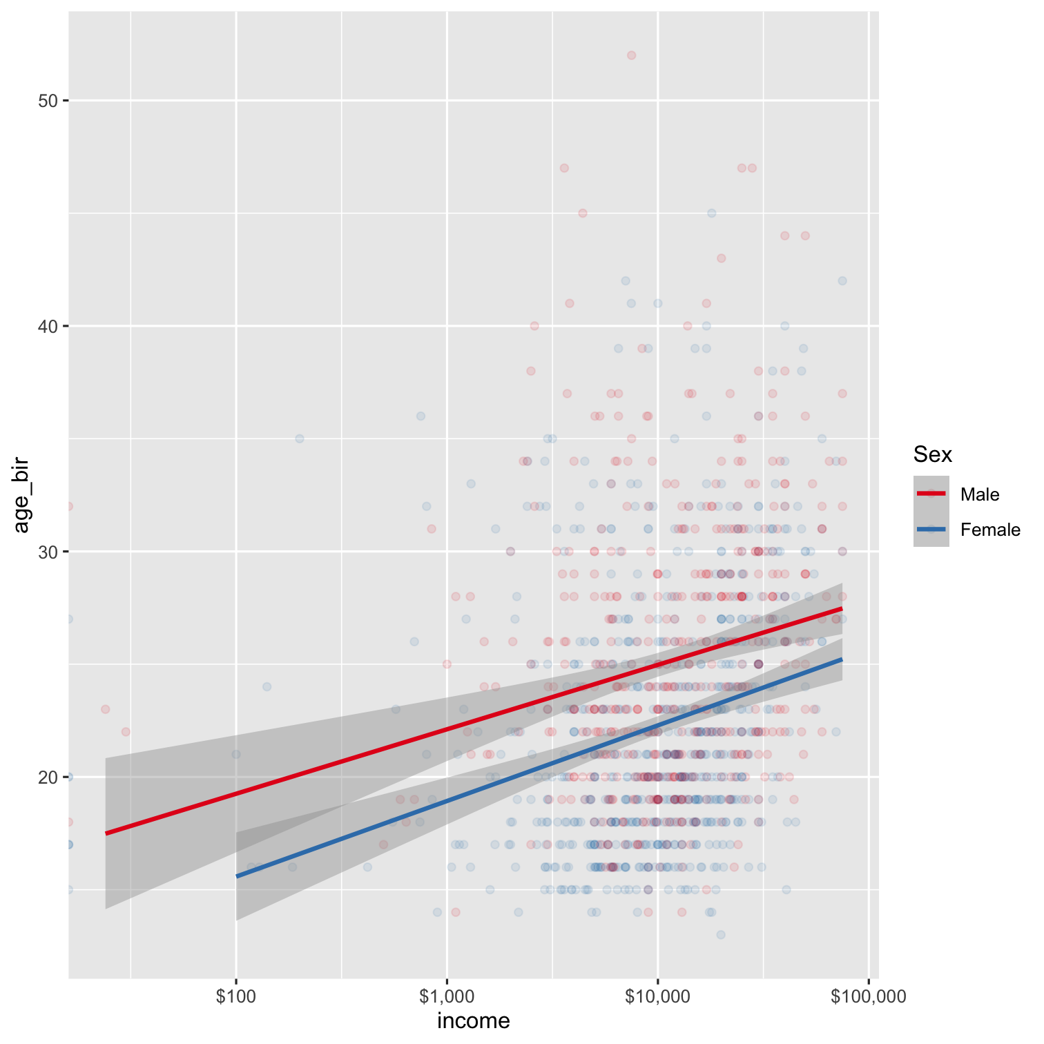 ] --- count: false .left-code[ ```r ggplot(data = nlsy, aes(x = income, y = age_bir, col = factor(sex)) ) + geom_point(alpha = 0.1) + scale_color_brewer(palette = "Set1", name = "Sex", labels = c("Male", "Female")) + scale_x_log10(labels = scales::dollar) + geom_smooth(aes( group = factor(sex)), method = "lm") + * facet_grid(rows = vars(race_eth), * labeller = labeller(race_eth = c( * "1" = "Hispanic", * "2" = "Black", * "3" = "Non-Black, Non-Hispanic"))) ``` ] .right-plot[ 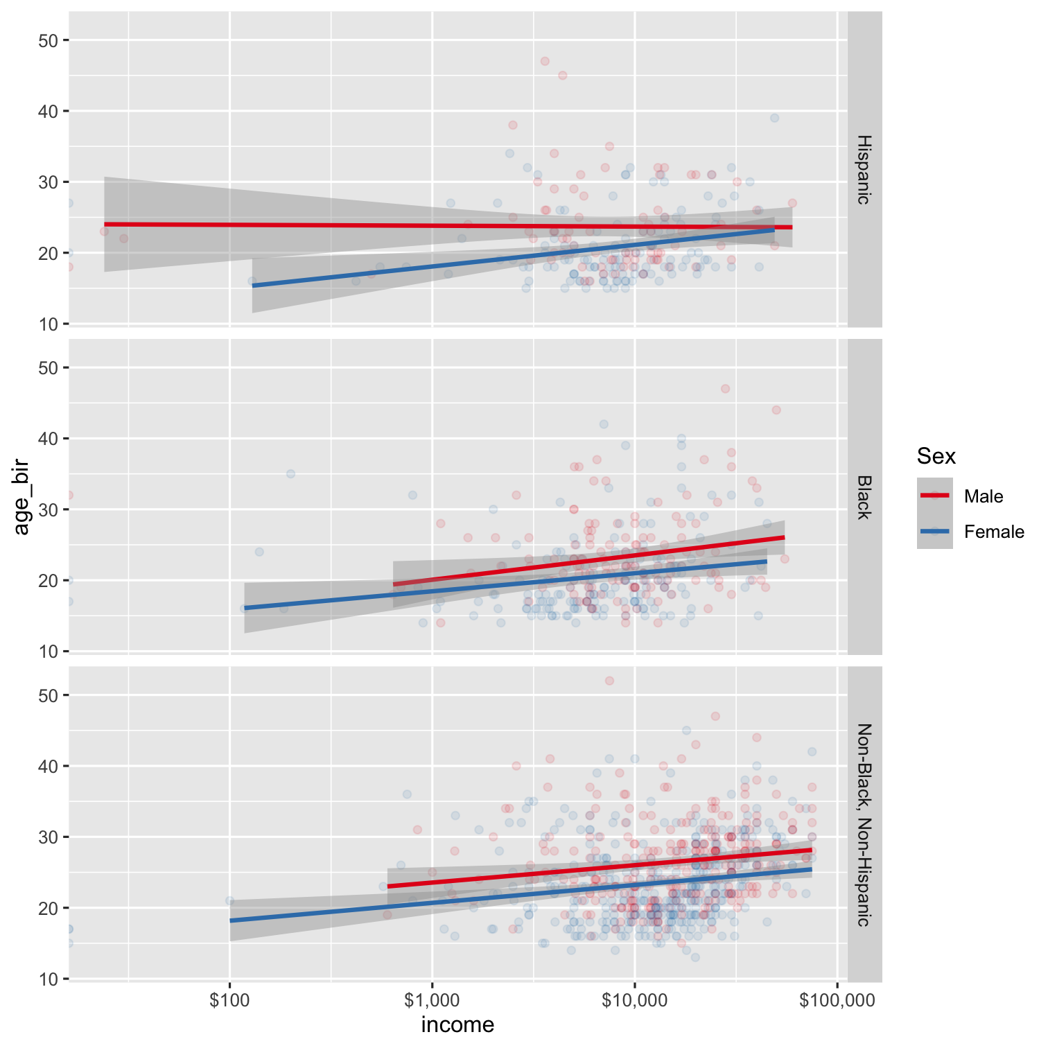 ] --- count: false .left-code[ ```r ggplot(data = nlsy, aes(x = income, y = age_bir, col = factor(sex)) ) + geom_point(alpha = 0.1) + scale_color_brewer(palette = "Set1", name = "Sex", labels = c("Male", "Female")) + scale_x_log10(labels = scales::dollar) + geom_smooth(aes( group = factor(sex)), method = "lm") + facet_grid(rows = vars(race_eth), labeller = labeller(race_eth = c( "1" = "Hispanic", "2" = "Black", "3" = "Non-Black, Non-Hispanic"))) + * theme_minimal() ``` ] .right-plot[ 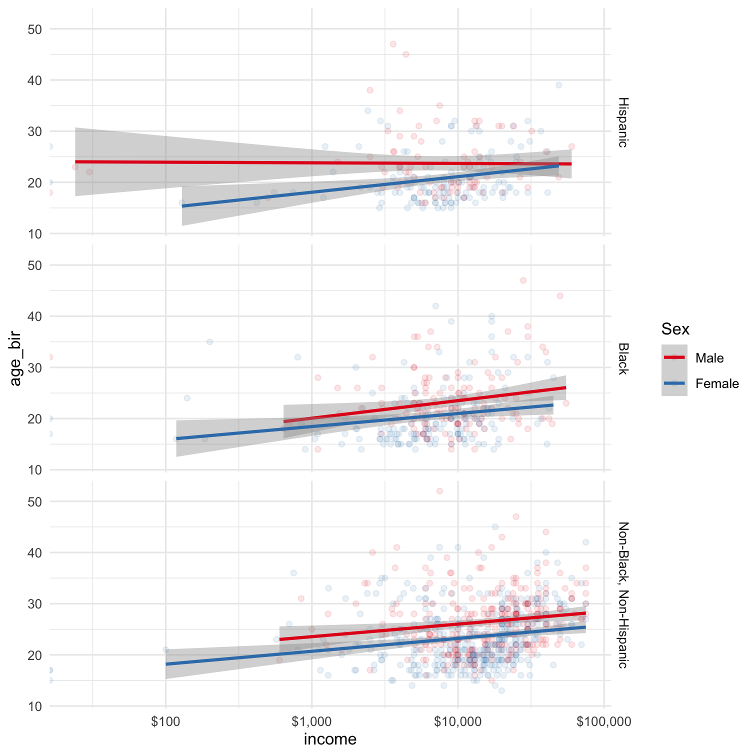 ] --- count: false .left-code[ ```r ggplot(data = nlsy, aes(x = income, y = age_bir, col = factor(sex)) ) + geom_point(alpha = 0.1) + scale_color_brewer(palette = "Set1", name = "Sex", labels = c("Male", "Female")) + scale_x_log10(labels = scales::dollar) + geom_smooth(aes( group = factor(sex)), method = "lm") + facet_grid(rows = vars(race_eth), labeller = labeller(race_eth = c( "1" = "Hispanic", "2" = "Black", "3" = "Non-Black, Non-Hispanic"))) + theme_minimal() + * theme(legend.position = "top") ``` ] .right-plot[ 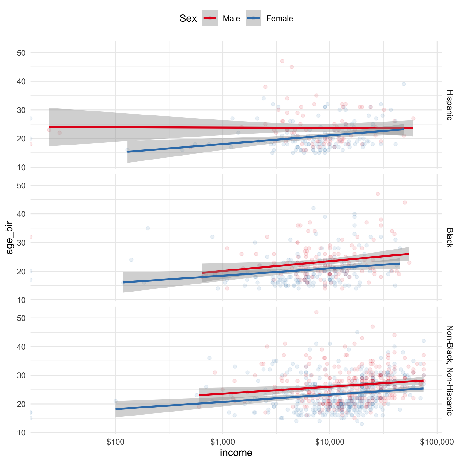 ] --- count: false .left-code[ ```r ggplot(data = nlsy, aes(x = income, y = age_bir, col = factor(sex)) ) + geom_point(alpha = 0.1) + scale_color_brewer(palette = "Set1", name = "Sex", labels = c("Male", "Female")) + scale_x_log10(labels = scales::dollar) + geom_smooth(aes( group = factor(sex)), method = "lm") + facet_grid(rows = vars(race_eth), labeller = labeller(race_eth = c( "1" = "Hispanic", "2" = "Black", "3" = "Non-Black, Non-Hispanic"))) + theme_minimal() + theme(legend.position = "top") + * labs(title = "Relationship between income and age at first birth", * subtitle = "by sex and race", * x = "Income", * y = "Age at first birth") ``` ] .right-plot[ 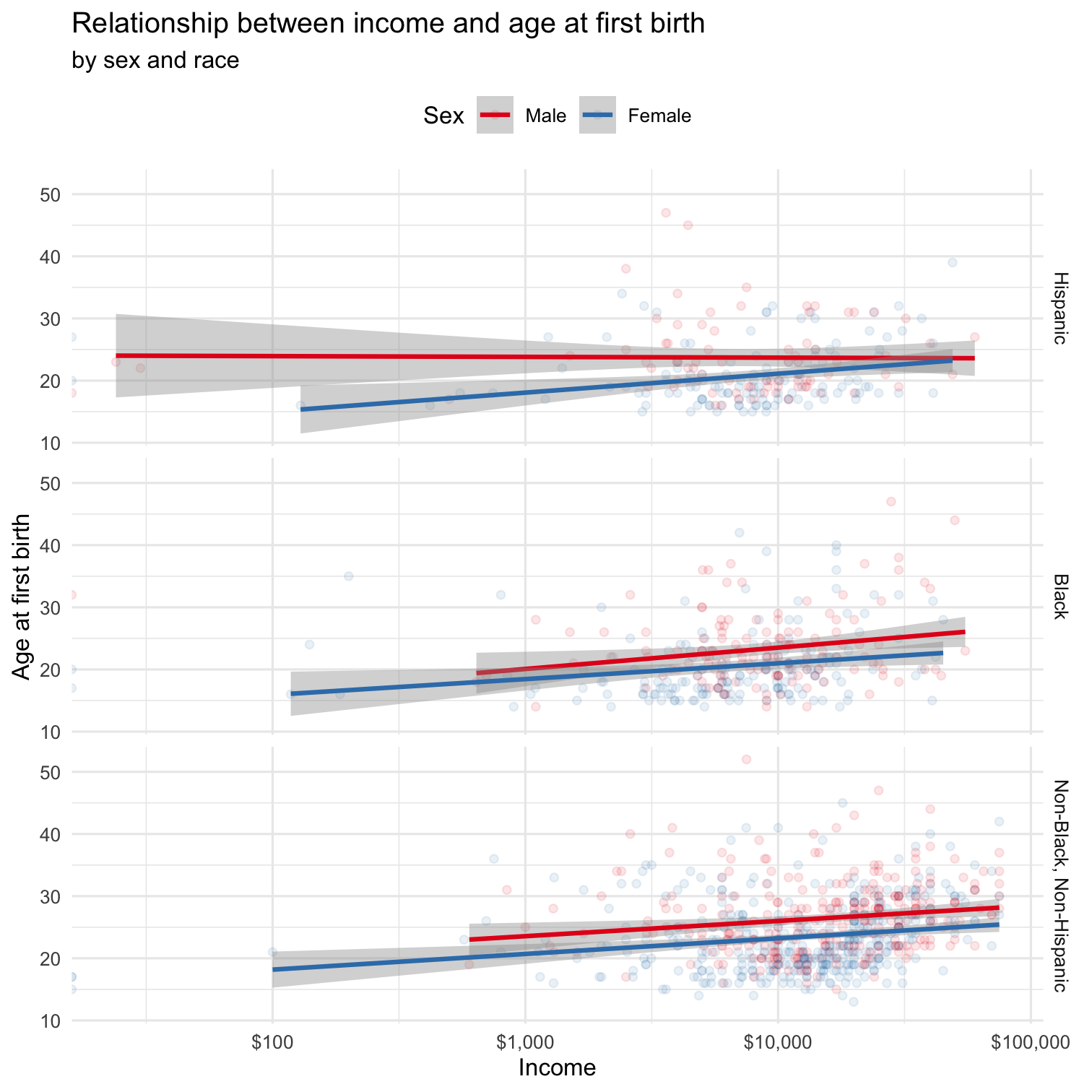 ] --- # Basic example ``` ggplot(data = {data}) + <geom>(aes(x = {xvar}, y = {yvar}, <characteristic> = {othvar}, ...), <characteristic> = "value", ...) + ... ``` --- count:true # Basic example ``` ggplot(data = `nlsy`) + <geom>(aes(x = {xvar}, y = {yvar}, <characteristic> = {othvar}, ...), <characteristic> = "value", ...) + ... ``` .large[The `data = ` argument must be a dataframe (or tibble)] --- count:true # Basic example ``` ggplot(data = nlsy) + `geom_point`(aes(x = {xvar}, y = {yvar}, <characteristic> = {othvar}, ...), <characteristic> = "value", ...) + ... ``` .large[ `geom_point()` gives us a scatterplot ] .center[ .go[Other helpful "geoms" include `geom_line()`, `geom_bar()`, `geom_histogram()`, `geom_boxplot()`]] --- <img src="../img/geoms.png" width="95%" style="display: block; margin: auto;" /> <!-- - A helpful reference can also be found here: http://sape.inf.usi.ch/quick-reference/ggplot2/geom --> .footnote[Image via https://nbisweden.github.io/RaukR-2019/ggplot/presentation/ggplot_presentation.html] --- count:true # Basic example ``` ggplot(data = nlsy) + geom_point(aes(x = `income`, y = `age_bir`, <characteristic> = {othvar}, ...), <characteristic> = "value", ...) + ... ``` `geom_point()` requires an `x = ` and a `y = ` variable Other geoms require other arguments - For example, `geom_histogram()` only requires an `x = ` variable .center[.go[Notice that the variable names are not in quotation marks]] --- count:true # Basic example ``` ggplot(data = nlsy, `aes(x = income, y = age_bir, <characteristic> = {othvar}, ...)`) + geom_point(<characteristic> = "value", ...) + ... ``` We could also put the aesthetics (the variables that are being mapped to the plot) in the initial `ggplot()` function - This will be helpful when we want multiple geoms (say, points and a line) --- .left-code[ ```r ggplot(data = nlsy) + geom_point(aes(x = income, y = age_bir)) ``` .large[ What if we want to change the color of the points? ]] .right-plot[ 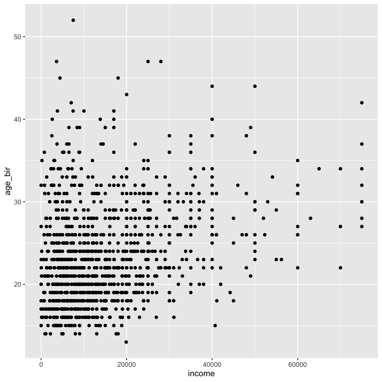 ] --- count:true .left-code[ ```r ggplot(data = nlsy) + geom_point(aes(x = income, y = age_bir), * color = "blue") ``` .large[When we put `color = ` *outside* the `aes()`, it means we're giving it a specific color value that applies to all the points.] ] .right-plot[ 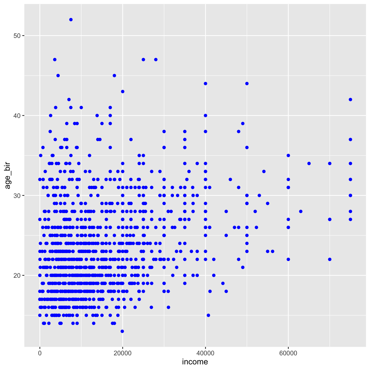 ] --- count:true .left-code[ ```r ggplot(data = nlsy) + geom_point(aes(x = income, y = age_bir), * color = "#3d93c8") ``` .center[.go[One of my favorite color resources: https://www.color-hex.com ]]] .right-plot[  ] --- count:true .left-code[ ```r ggplot(data = nlsy) + geom_point(aes(x = income, y = age_bir, * color = eyesight)) ``` .large[ When we put `color = ` *inside* the `aes()` -- with no quotation marks -- it means we're telling it how it should assign colors. Here we're plotting the values according to eyesight, where 1 is excellent and 5 is poor. - But they're kind of hard to distinguish! ] ] .right-plot[ 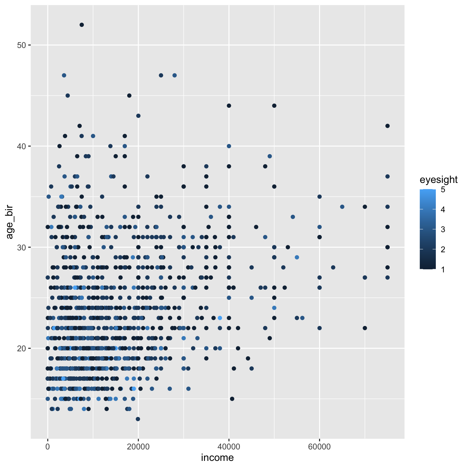 ] --- count:true .left-code[ ```r ggplot(data = nlsy) + geom_point(aes(x = income, y = age_bir, color = eyesight)) + *scale_color_gradient(low = "green", * high = "purple") ``` .large[We can map the values of `eyesight` to a different continuous scale using `scale_color_gradient()` You can read lots more about this function [here](https://ggplot2.tidyverse.org/reference/scale_gradient.html), so you don't have to have such ugly color scales! ] ] .right-plot[ 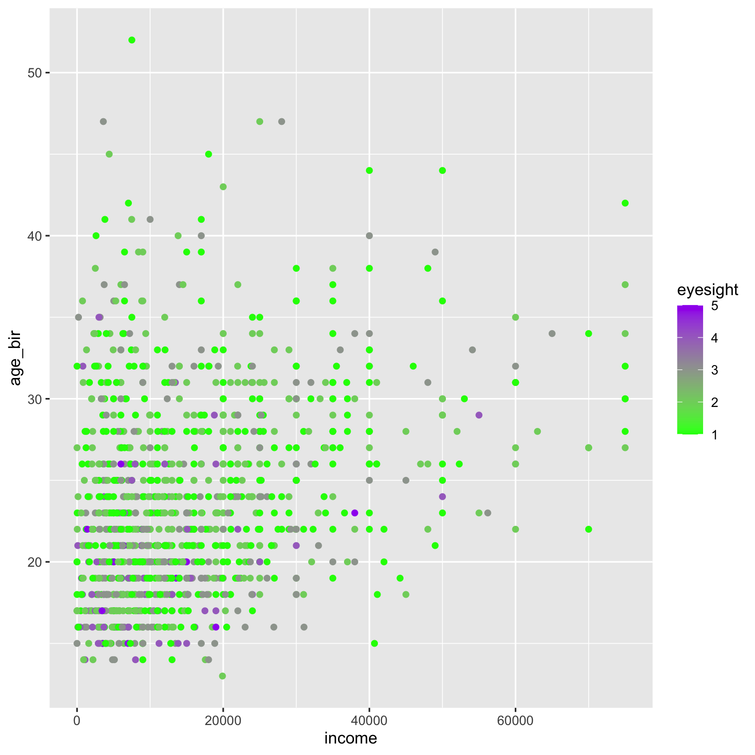 ] --- count:true .left-code[ ```r ggplot(data = nlsy) + geom_point(aes(x = income, y = age_bir, color = eyesight)) ``` .large[Returning to the nice blues, we think: But wait! The variable `eyesight` isn't really continuous: it has 5 discrete values. ] ] .right-plot[  ] --- count:true .left-code[ ```r ggplot(data = nlsy) + geom_point(aes(x = income, y = age_bir, color = `factor(eyesight)`)) ``` .large[Returning to the nice blues, we think: But wait! The variable `eyesight` isn't really continuous: it has 5 discrete values. We can make R treat it as a "factor", or categorical variable, with the `factor()` function ] .center[.go[We'll see lots more on factors later!]] ] .right-plot[ 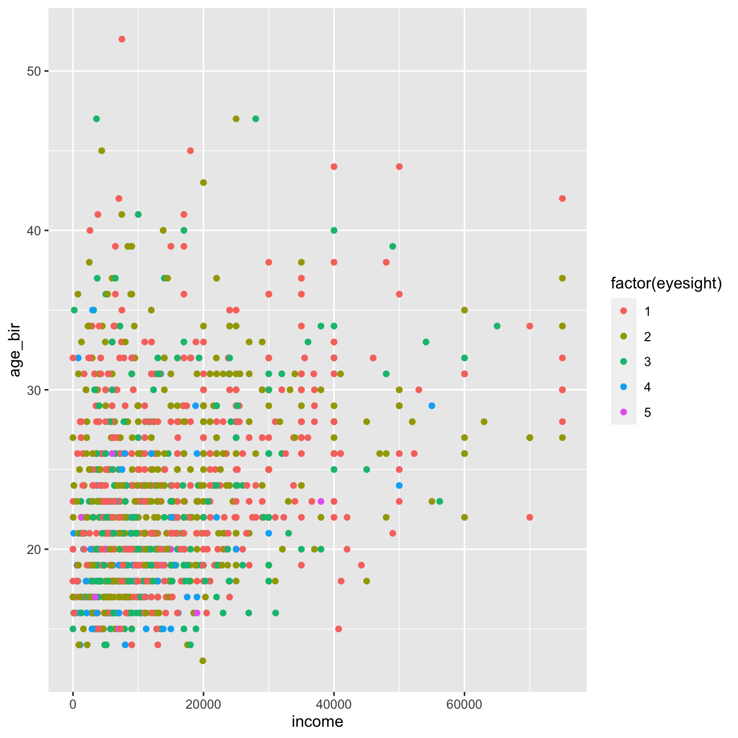 ] --- count:true .left-code[ ```r ggplot(data = nlsy) + geom_point(aes(x = income, y = age_bir, color = factor(eyesight))) + *scale_color_manual( * values = c("blue", "purple", "red", * "green", "yellow")) ``` .large[Now if we want to change the color scheme, we have to use a different function. Before we used `scale_color_gradient`, now `scale_color_manual`. - There are a lot of options that follow the same naming scheme.] ] .right-plot[ 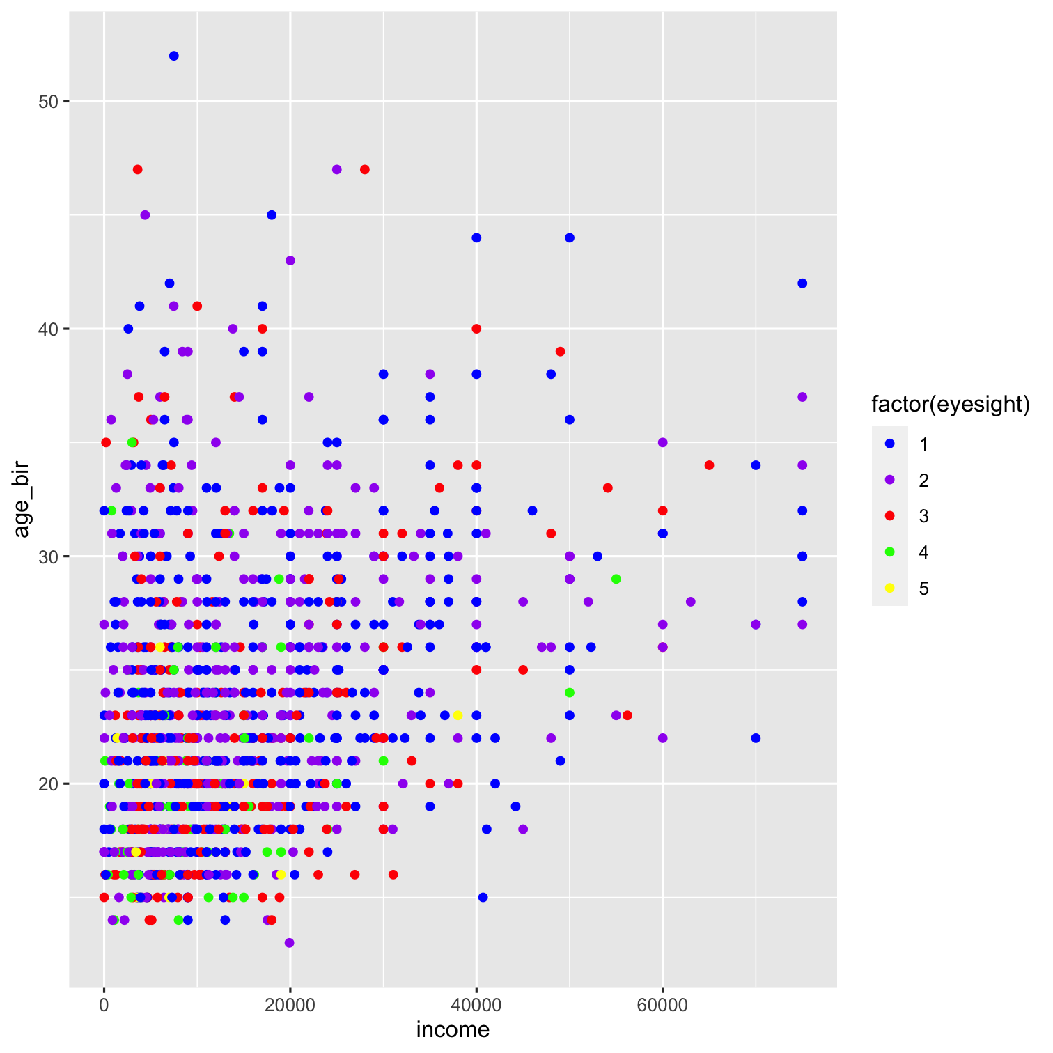 ] --- count:true .left-code[ ```r ggplot(data = nlsy) + geom_point(aes(x = income, y = age_bir, color = factor(eyesight))) + *scale_color_brewer(palette = "Set1") ``` .large[There are tons of different options in R for color palettes. You can play around with those in the `RColorBrewer` package here: http://colorbrewer2.org] - You can access the scales in that package with `scale_color_brewer()`, or see them all after installing the package with `RColorBrewer::display.brewer.all()` ] .right-plot[ 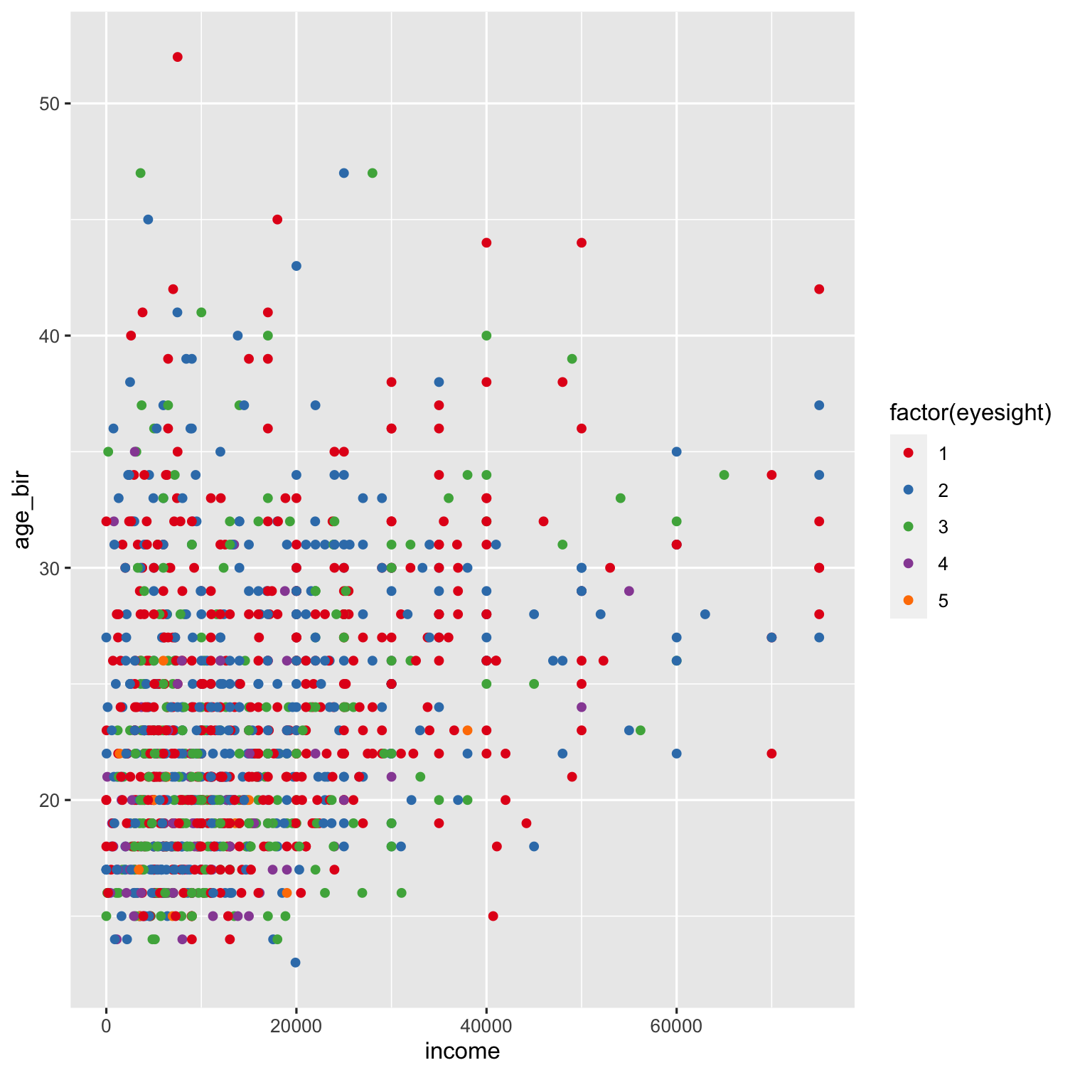 ] --- count:true .left-code[ ```r ggplot(data = nlsy) + geom_point(aes(x = income, y = age_bir, color = factor(eyesight))) + scale_color_brewer(palette = "Set1", * name = "Eyesight", * labels = c("Excellent", * "Very Good", * "Good", * "Fair", * "Poor")) ``` .large[Each of the `scale_color_x()` functions has a lot of the same arguments.] .center[.go[Make sure if you are labelling a factor variable in a plot like this that you get the names right!]] ] .right-plot[ 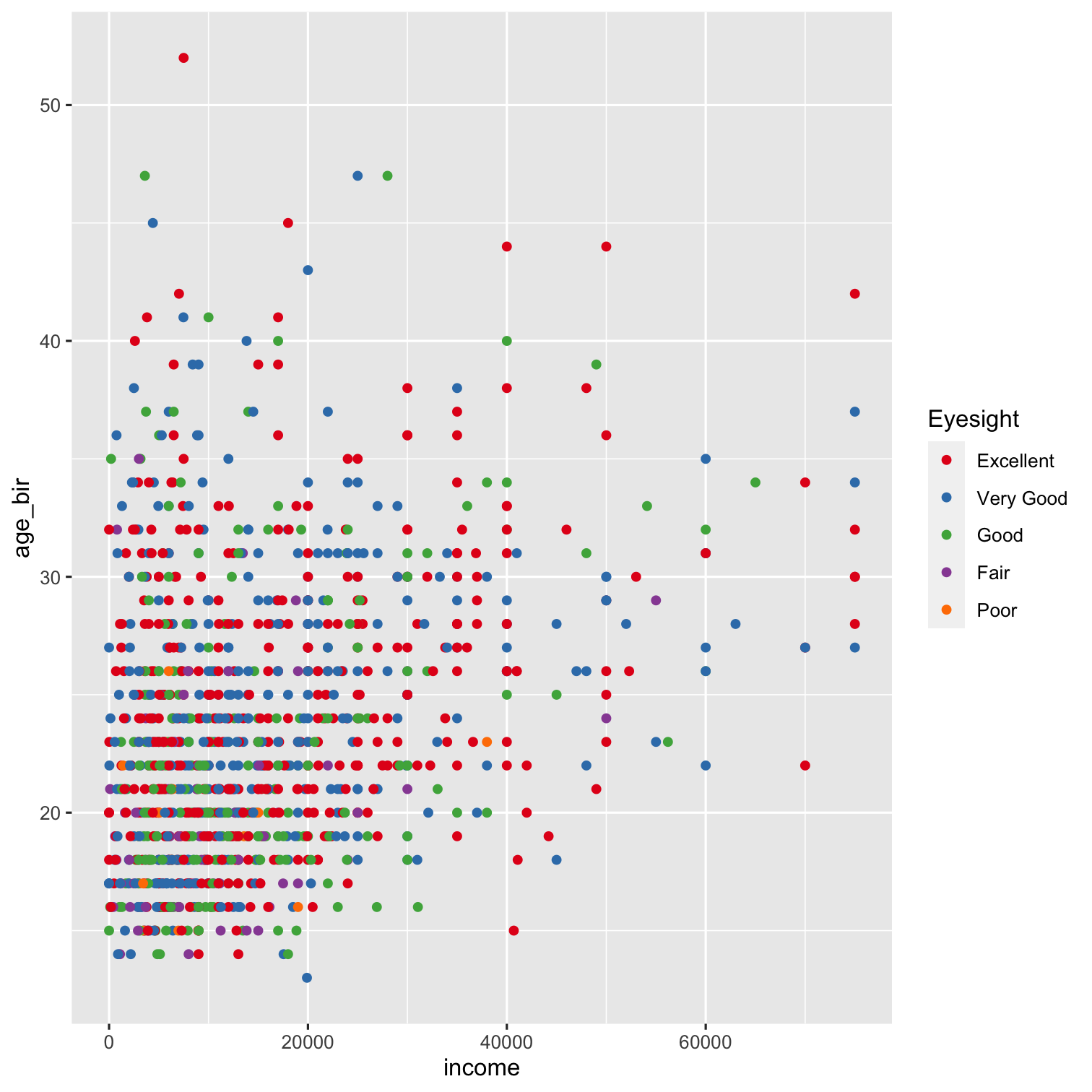 ] --- class: inverse .pull-left[ .huge-number[ 1 ] ] .hand-large[ Your turn... ] .exercise[ Exercises 2.1: Make a fancy scatterplot showing the relationship between sleep on weekdays and on weekends. ] <!-- 1. Using the NLSY data, make a scatter plot of the relationship between hours of sleep on weekends and weekdays. Color it according to region (where 1 = northeast, 2 = north central, 3 = south, and 4 = west). --> <!-- 2. Replace `geom_point()` with `geom_jitter()`. What does this do? Why might this be a good choice for this graph? Play with the `width = ` and `height = ` options. This site may help: https://ggplot2.tidyverse.org/reference/geom_jitter.html --> <!-- 3. Use the `shape = ` argument to map the sex variable to different shapes. Change the shapes to squares and diamonds. (Hint: how did we manually change colors to certain values? This might help: https://ggplot2.tidyverse.org/articles/ggplot2-specs.html) --> --- # Facets One of the most useful features of `ggplot2` is the ability to "facet" a graph by splitting it up according to the values of some variable. You might use this to show results for a lot of outcomes or exposures at once, for example, or see how some relationship differs by something like age or geographic region .center[  ] --- .left-code[ ```r ggplot(data = nlsy) + `geom_bar(aes`(x = nsibs)) + labs(x = "Number of siblings") ``` .large[We'll introduce bar graphs at the same time! Notice how we only need an `x = ` argument - the y-axis is automatically the count with this geom. ] ] .right-plot[ 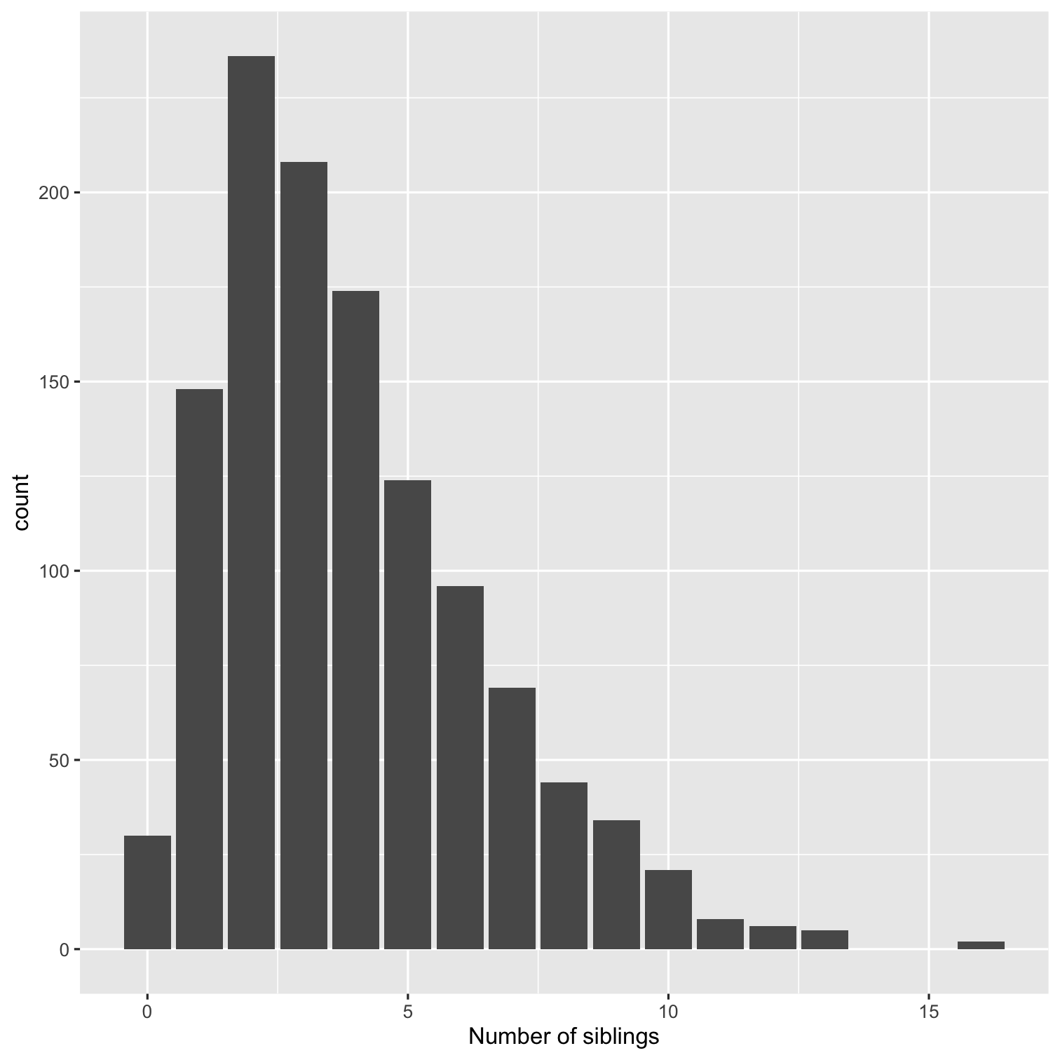 ] --- count:true .left-code[ ```r ggplot(data = nlsy) + geom_bar(aes(x = nsibs)) + labs(x = "Number of siblings") + * facet_grid(cols = vars(region)) ``` .large[The `facet_grid()` function splits up the data according to a variable(s). Here we've split it by region into columns. ] ] .right-plot[ 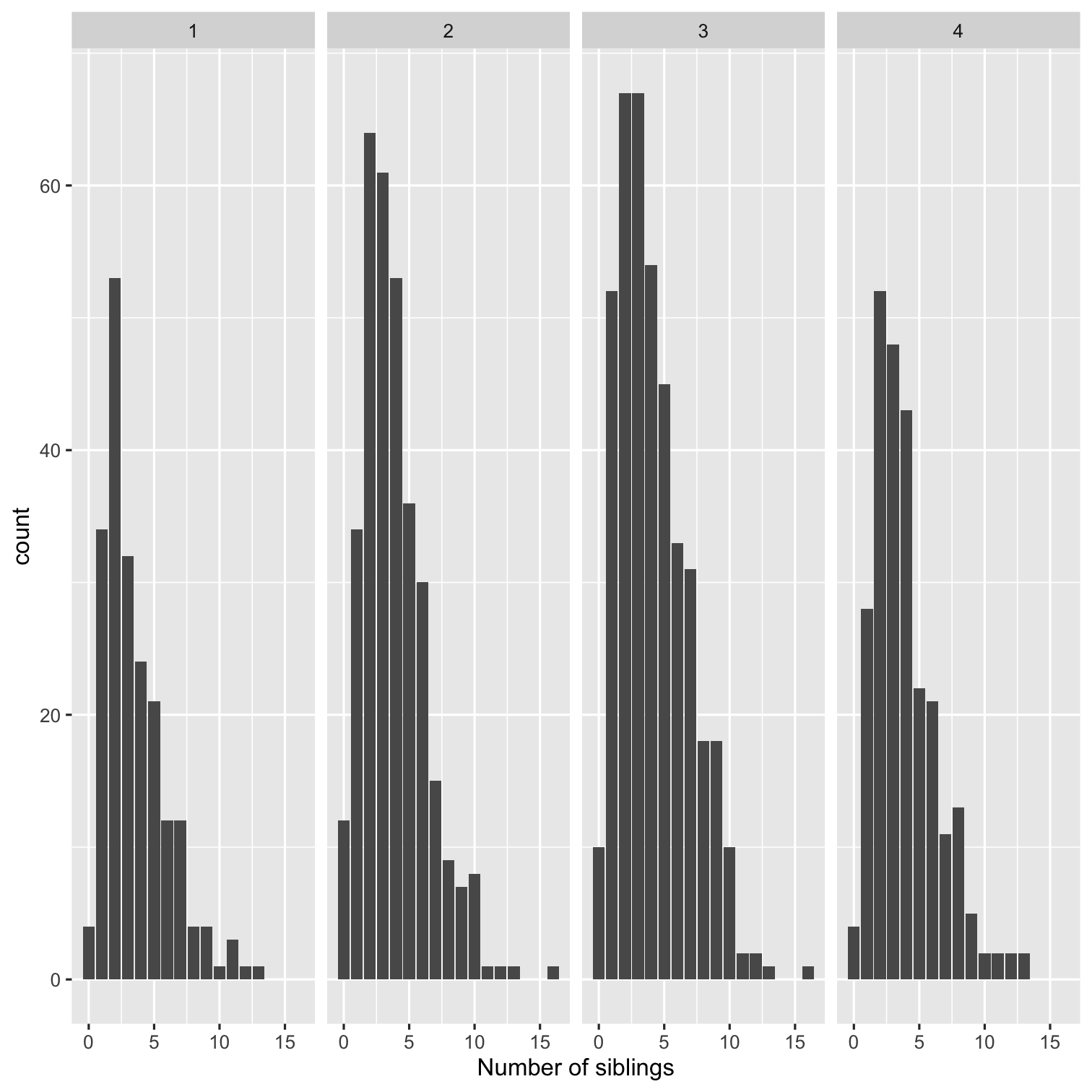 ] --- count:true .left-code[ ```r ggplot(data = nlsy) + geom_bar(aes(x = nsibs)) + labs(x = "Number of siblings") + facet_grid(`rows` = vars(region)) ``` .large[Since this is hard to read, we'll probably want to split by rows instead. ] ] .right-plot[ 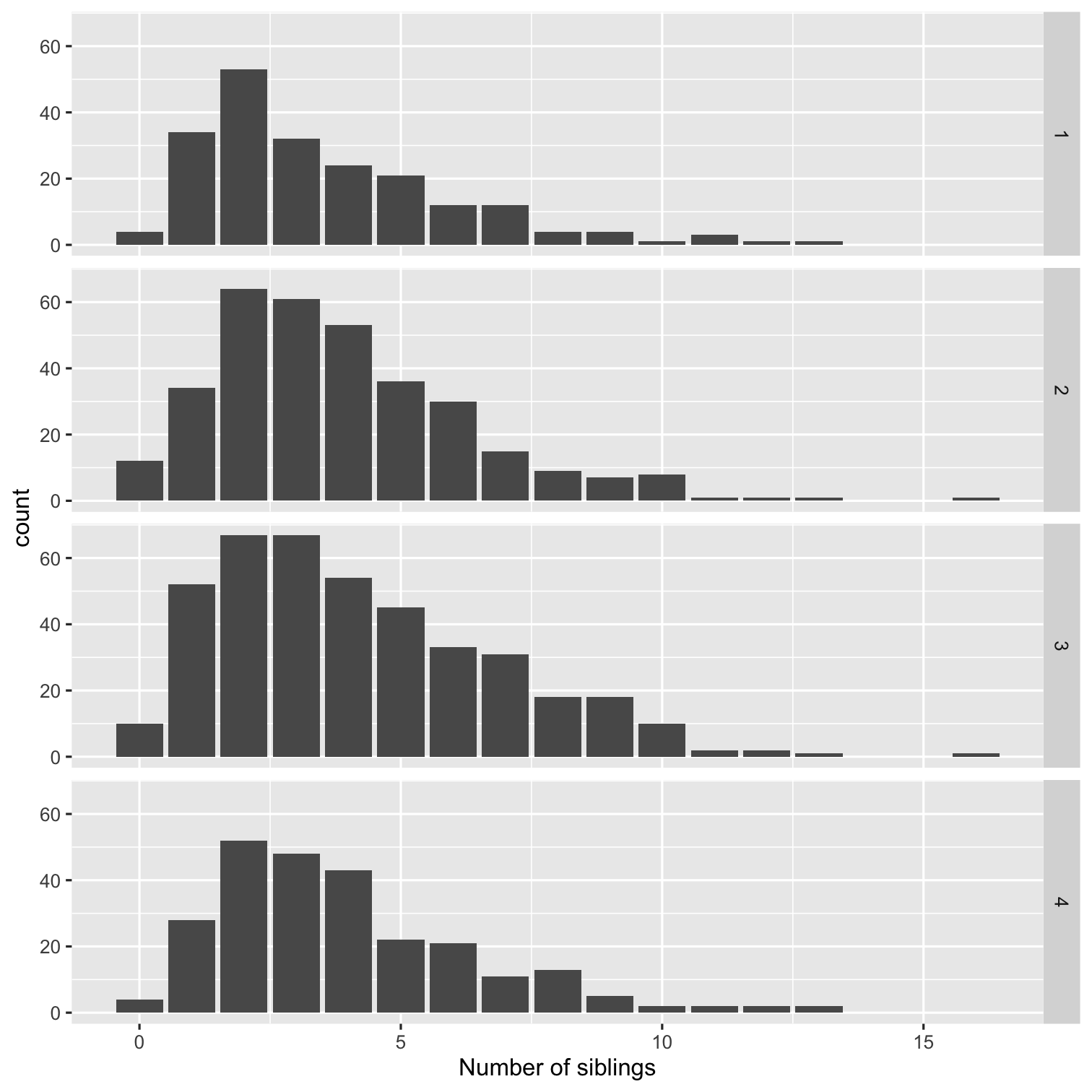 ] --- count:true .left-code[ ```r ggplot(data = nlsy) + geom_bar(aes(x = nsibs)) + labs(x = "Number of siblings") + facet_grid(rows = vars(region), `margins = TRUE`) ``` .large[We can also add a row for all of the data together.] ] .right-plot[ 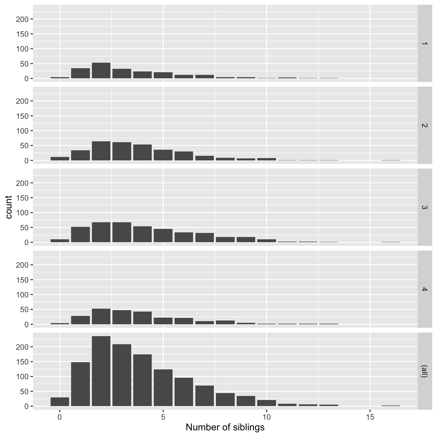 ] --- count:true .left-code[ ```r ggplot(data = nlsy) + geom_bar(aes(x = nsibs)) + labs(x = "Number of siblings") + facet_grid(rows = vars(region), margins = TRUE, `scales = "free_y"`) ``` .large[This squishes the other rows though! We can allow them all to have their own axis limits with the `scales = ` argument. Other options are "free_x" if we want to allow the x-axis scale to vary, or just "free" to combine both. ] ] .right-plot[ 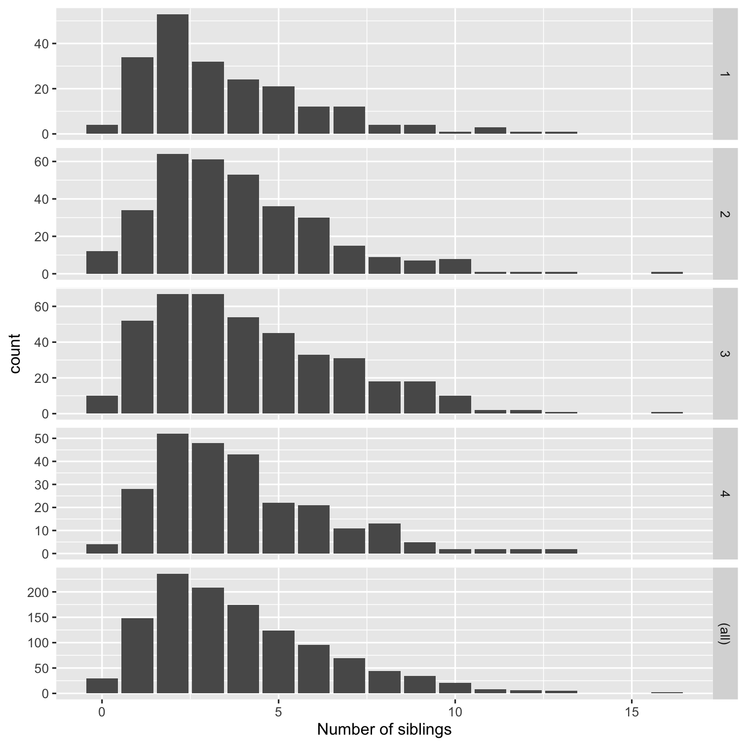 ] --- count:true .left-code[ ```r ggplot(data = nlsy) + geom_bar(aes(x = nsibs)) + labs(x = "Number of siblings") + * facet_wrap(vars(region)) ``` .large[We can use `facet_wrap()` instead, if we want to use both multiple rows and columns for all the values of a variable. ] ] .right-plot[ 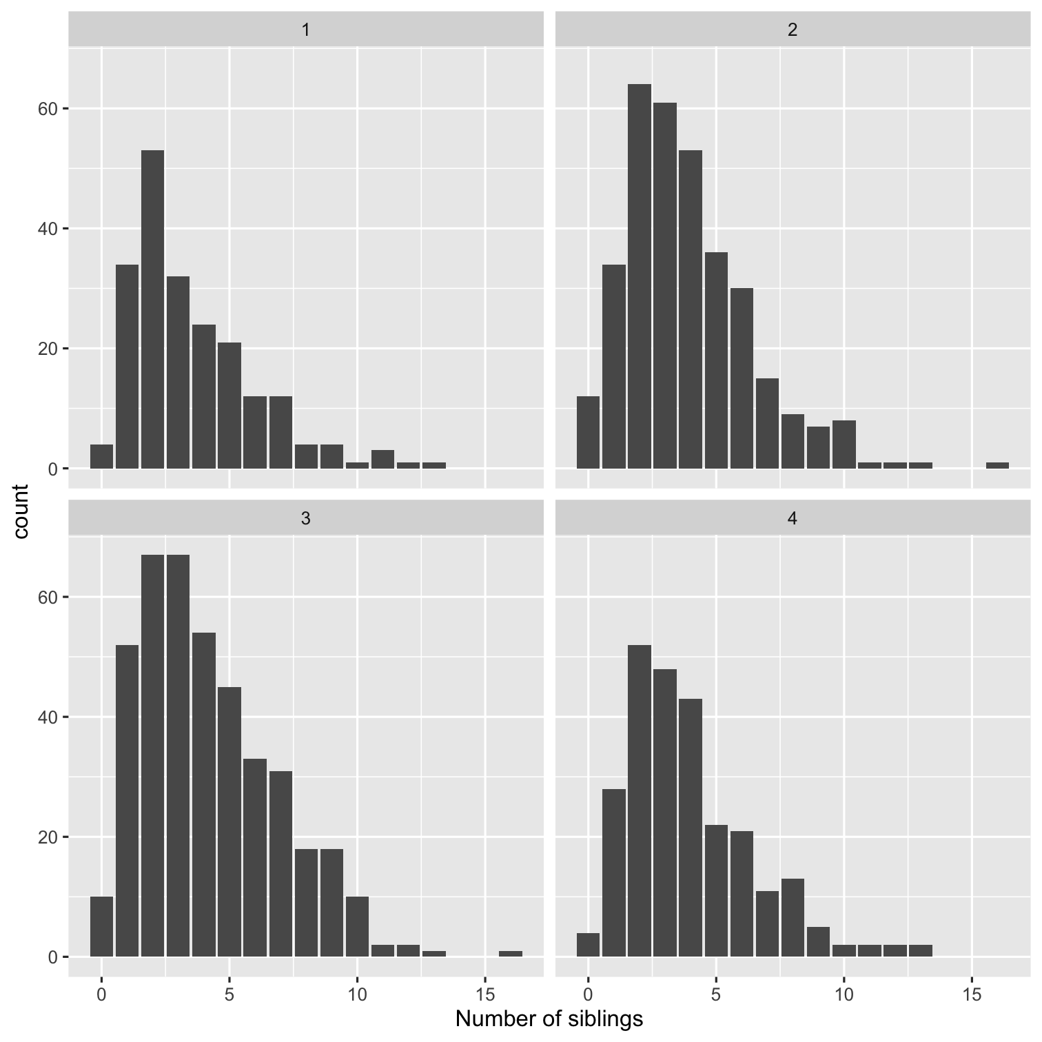 ] --- count:true .left-code[ ```r ggplot(data = nlsy) + geom_bar(aes(x = nsibs)) + labs(x = "Number of siblings") + facet_wrap(vars(region), * ncol = 3) ``` .center[.go[It tries to make a good decision, but you can override how many columns you want!]] ] .right-plot[ 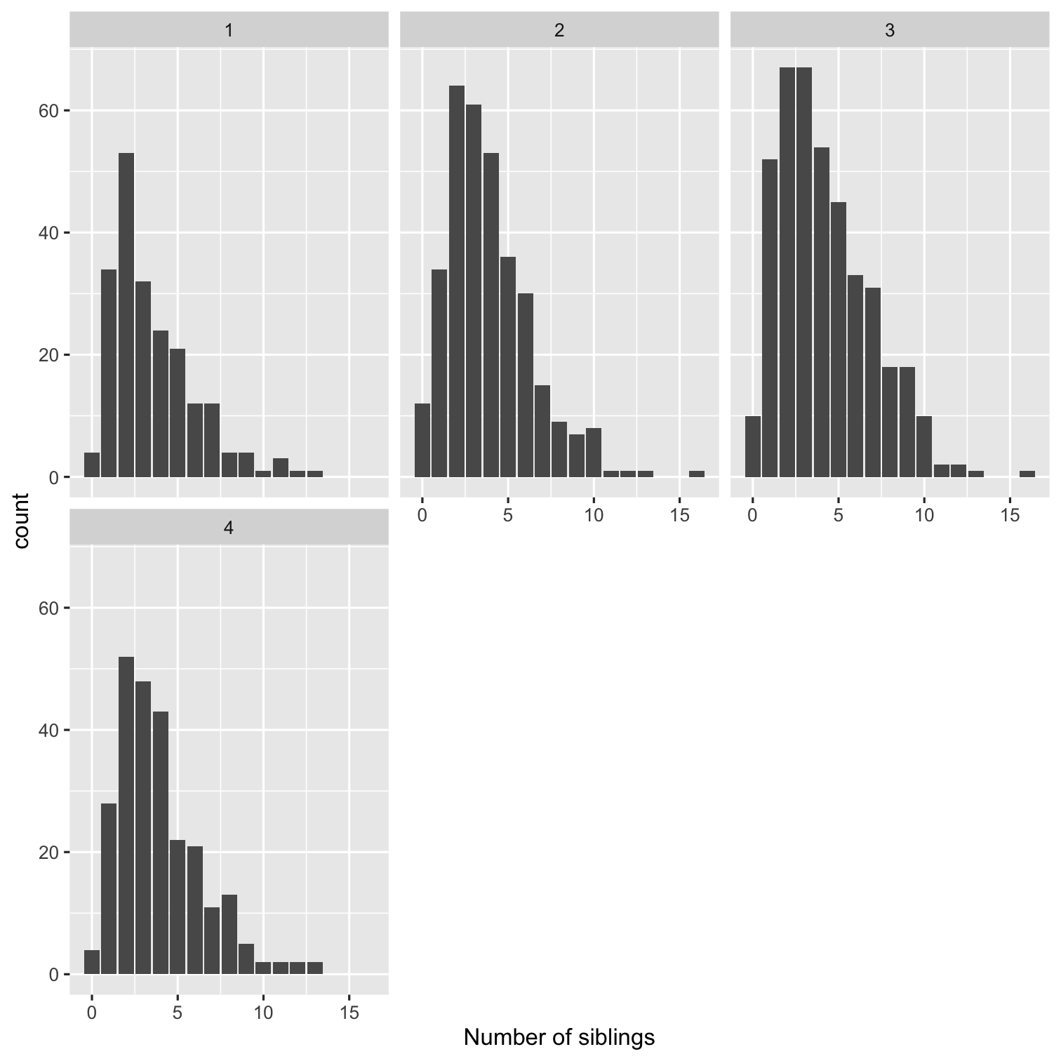 ] --- # Wait, these look like histograms! When we have a variable with a lot of possible values, we may want to bin them with a histogram ```r ggplot(nlsy) + geom_histogram(aes(x = income)) ``` <img src="02-slides_files/figure-html/unnamed-chunk-7-1.png" width="50%" style="display: block; margin: auto;" /> --- # `stat_bin()` using `bins = 30`. Pick better value with `binwidth`. We used discrete values with `geom_bar()`, but with `geom_histogram()` we're combining values: the default is into 30 bins. This is one of the most common warning messages I get in R! <br> <img src="https://www.washingtonpost.com/pbox.php?url=http://www.washingtonpost.com/news/volokh-conspiracy/wp-content/uploads/sites/14/2015/08/Warning-2.gif&w=1484&op=resize&opt=1&filter=antialias&t=20170517" width="50%" style="display: block; margin: auto;" /> --- .left-code[ ```r ggplot(data = nlsy) + geom_histogram(aes(x = income), * bins = 10) ``` .center[.go[We can use `bins = ` instead, if we want!]] ] .right-plot[ 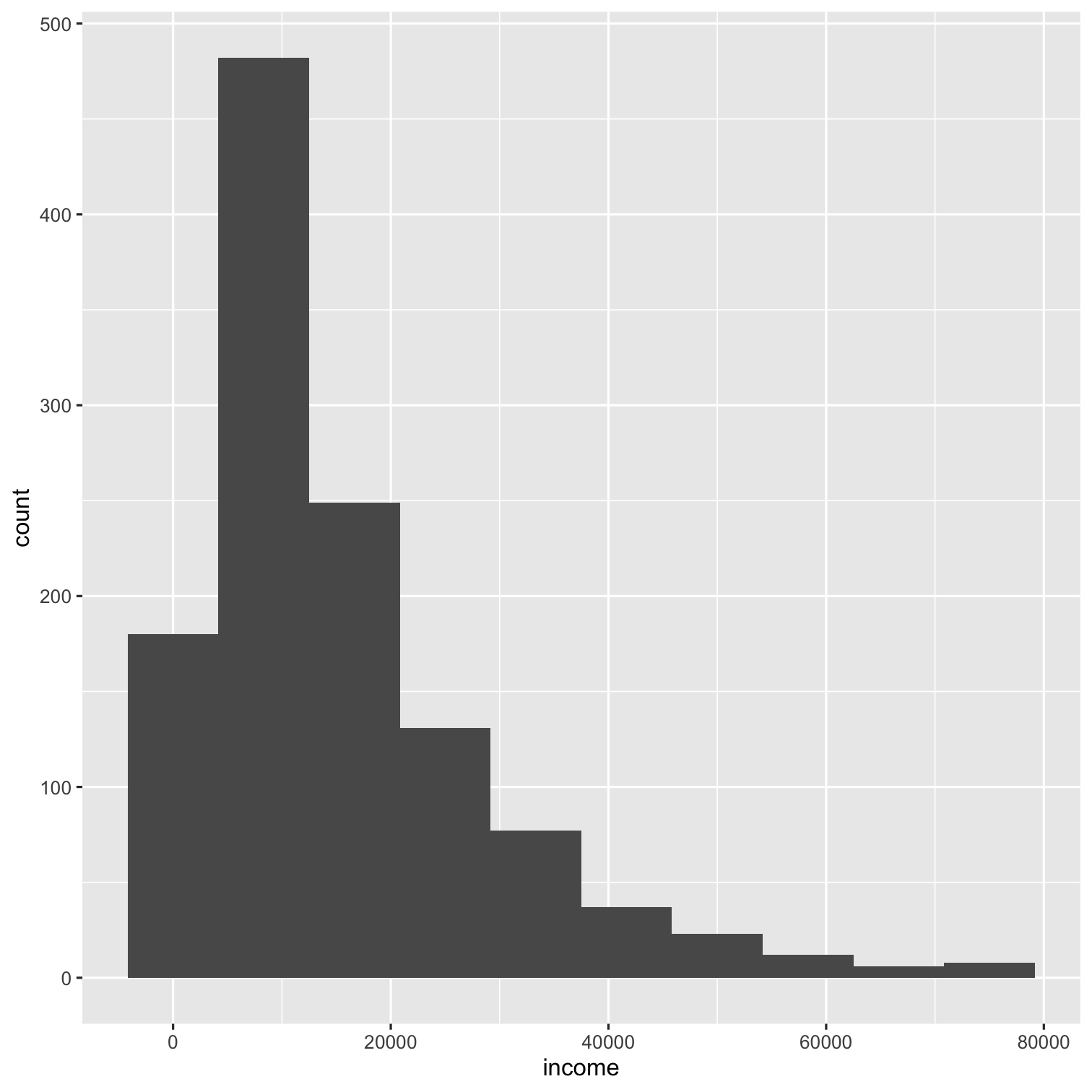 ] --- count:true .left-code[ ```r ggplot(data = nlsy) + geom_histogram(aes(x = income), * bins = 100) ``` .center[.go[Be aware that you may interpret your data differently depending on how you bin it!]] ] .right-plot[  ] --- count:true .left-code[ ```r ggplot(data = nlsy) + geom_histogram(aes(x = income), * binwidth = 1000) ``` .center[.go[Sometimes the bin width actually has some meaning]] ] .right-plot[  ] --- count:true .left-code[ ```r ggplot(data = nlsy) + geom_histogram(aes(x = income), bins = 100) + * scale_x_log10() ``` There are a lot of `scale_x_()` and `scale_y_()` functions for you to explore! .center[.go[The naming schemes work similarly to the `scale_color` ones, just with different options!]] ] .right-plot[  ] --- class: inverse .pull-left[ .huge-number[ 2 ] ] .hand-large[ Your turn... ] .exercise[ Exercises 2.2: Make a fancy histogram showing the distribution of income in this data. ] <!-- 1. When we're comparing distributions with very different numbers of observations, instead of scaling the y-axis like we did with the `facet_grid()` function, we might want to make density histograms. Use google to figure out how to make a density histogram of income. Facet it by region. --> <!-- 2. Make each of the regions in your histogram from part 1 a different color. (Hint: compare what `col = ` and `fill = ` do to histograms). --> <!-- 3. Instead of a log-transformed x-axis, make a square-root transformed x-axis. --> <!-- 4. Doing part 3 squishes the labels on the x-axis. Using the `breaks = ` argument that all the `scale_x_()` functions have, make labels at 1000, 10000, 25000, and 50000. --> --- # Finally, themes to make our plots prettier You probably recognize the ggplot theme. But did you know you can trick people into thinking you made your figures in Stata? .pull-left[ <img src="02-slides_files/figure-html/unnamed-chunk-9-1.png" width="85%" style="display: block; margin: auto;" /> ] .pull-right[ <img src="02-slides_files/figure-html/unnamed-chunk-10-1.png" width="85%" style="display: block; margin: auto;" /> ] --- .left-code[ ```r *p <- ggplot(data = nlsy) + geom_boxplot(aes( x = factor(sleep_wknd), y = sleep_wkdy, fill = factor(sleep_wknd))) + scale_fill_discrete(guide = FALSE) + labs(x = "hours slept on weekends", y = "hours slept on weekends", title = "The more people sleep on weekends, the more they\n sleep on weekdays", subtitle = "According to NLSY data") p ``` Let's store our plot first. Plots work just like other R objects, meaning we can use the assignment arrow. .center[.go[Can you figure out what each chunk of this code is doing to the figure?]] ] .right-plot[ 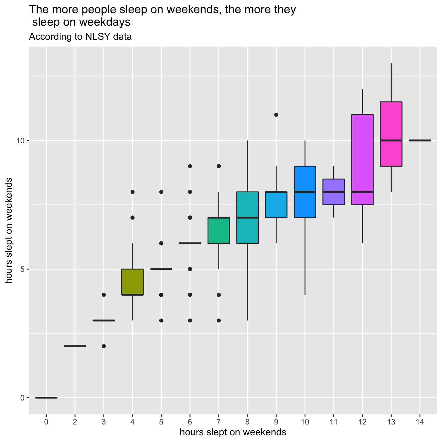 ] --- count:true .left-code[ ```r p + * theme_minimal() ``` .large[We can change the overall theme .center[.go[Since we stored the plot as `p`, it's easy to add on / try different things]] ]] .right-plot[  ] --- count:true .left-code[ ```r p + * theme_dark() ``` ] .right-plot[  ] --- count:true .left-code[ ```r p + * theme_classic() ``` ] .right-plot[  ] --- count:true .left-code[ ```r p + * theme_void() ``` ] .right-plot[  ] --- count:true .left-code[ ```r p + * ggthemes::theme_fivethirtyeight() ``` .large[Other packages may contain themes.] ] .right-plot[  ] --- count:true .left-code[ ```r p + * ggthemes::theme_excel_new() ``` .large[In case you miss Excel....] ] .right-plot[ 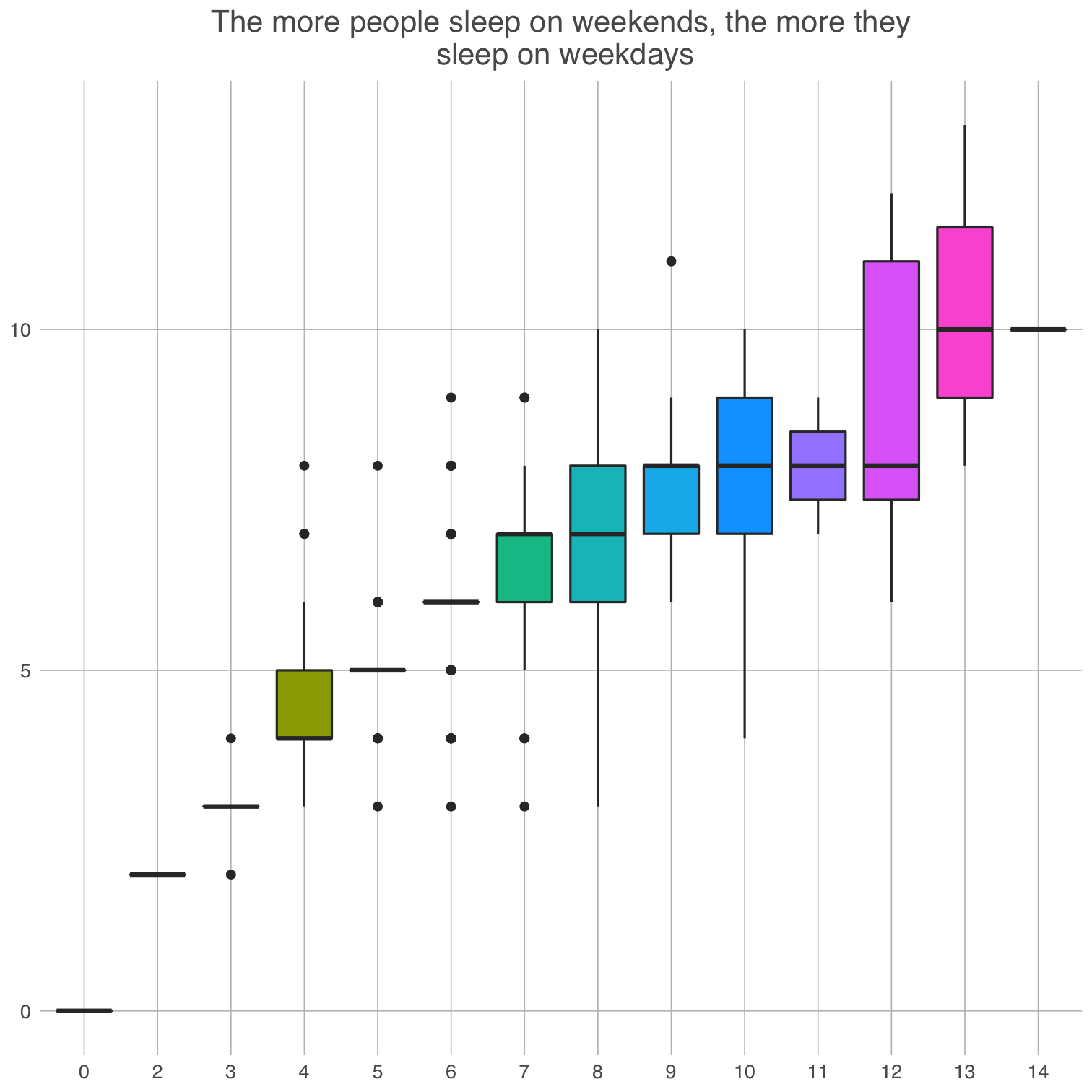 ] --- count:true .left-code[ ```r p + * ggthemes::theme_gdocs() ``` ] .right-plot[  ] --- count:true .left-code[ ```r p + * louisahstuff::my_theme() ``` .center[.go[You can even make your own!]] ] .right-plot[ 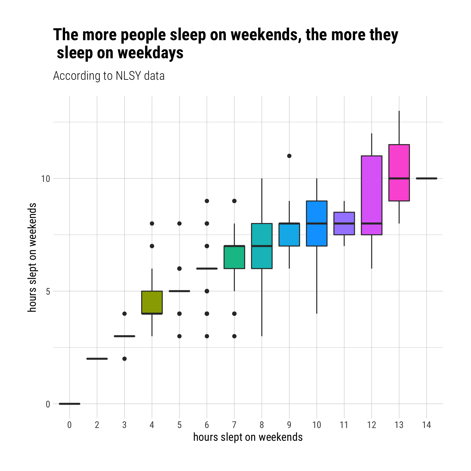 ] --- class:big-code # Finally, save it! If your data changes, you can easily run the whole script again: ```r library(tidyverse) dataset <- read_csv("dataset.csv") ggplot(dataset) + geom_point(aes(x = xvar, y = yvar)) `ggsave`(filename = "scatterplot.pdf") ``` The `ggsave()` function will automatically save the most recent plot in your output. To be safe, you can store your plot, e.g., `p <- ggplot(...) + ...` and then ```r ggsave(filename = "scatterplot.pdf", plot = p) ``` --- # More resources .left-col[ - Cheat sheet: https://www.rstudio.com/resources/cheatsheets/#ggplot2 - Catalog: http://shiny.stat.ubc.ca/r-graph-catalog/ - Cookbook: http://www.cookbook-r.com/Graphs/ - Official package reference: https://ggplot2.tidyverse.org/index.html - List of themes and instructions to make your own: https://www.datanovia.com/en/blog/ggplot-themes-gallery/ ] .right-col[  ] --- class: inverse .pull-left[ .huge-number[ 3 ] ] .hand-large[ Your turn... ] .exercise[ Exercises 2.3: Recreate this plot! <!-- Work through gradually filling in things to build up --> <img src="02-slides_files/figure-html/unnamed-chunk-13-1.png" width="55%" style="display: block; margin: auto auto auto 0;" /> ]