Lab
2 Figures
You can either download the lab as an RMarkdown file here, or copy and paste the code as we go into a .R script. Either way, save it into the 02-week folder where you completed the exercises!
2.1 Plots in R
RStudio
In RStudio, plots you make pop up in the “Plots” window, as I’m sure you have found. This is helpful for interactive exploration and saving of your plots. Using Export -> Save as Image is especially useful for helping to figure out the best aspect ratio for your plot. Try it out:
data(mtcars)
plot(mtcars$mpg, mtcars$wt)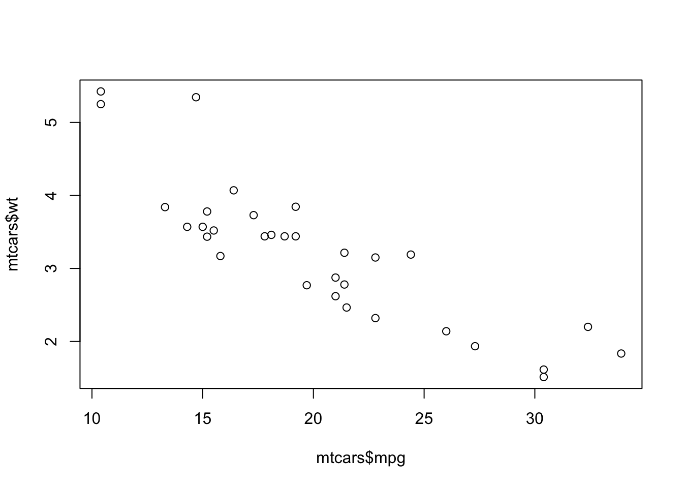 Notice that we didn’t need to load any packages for that to work. The
 mtcars dataset is built into R, as is the plot() function. This is base R plotting. For making figures in R, the ggplot2 package is much more popular because it is essentially endlessly flexible, as well as more asthetically pleasing (at least in my opinion).
One problem that always trips people up is not actually an R error, but a message that shows up in the “Plots” window about margins. All that’s required is resizing the window, but I’ve seen it lead to panic (in myself included, before I learned what the problem was). I’ll demonstrate.
plot(mtcars$mpg, mtcars$wt)
RMarkdown
We’ll gradually be introducing some RMarkdown concepts. Today I’ll show you some “chunk options”. These tell R specifics about how to evaluate the code inside a chunk. There are tons and you can make your own! Here’s a write-up of all the options related to plotting: https://yihui.org/knitr/options/#plots. The ones I use most often are: fig.width, fig.height, and sometimes fig.cap.
If you knit this document (or look at it on the website), you can see the difference.
plot(mtcars$mpg, mtcars$wt)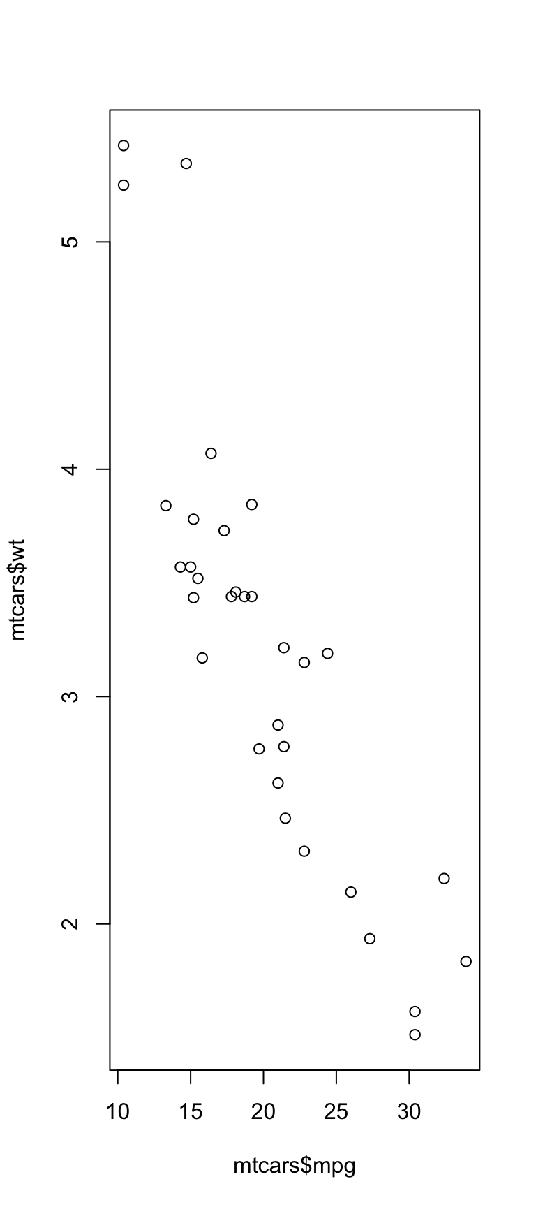
plot(mtcars$mpg, mtcars$wt)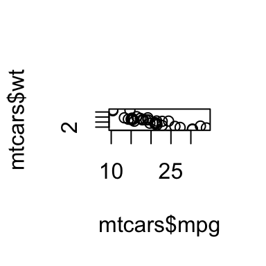
Figure 2.1: Tiny picture
You can also set these options for the whole document in the setup chunk at the beginning. You’ve probably noticed all the options I include there; you could add others. For example, if you had this code:
knitr::opts_chunk$set(
  fig.width = 2,
  fig.height = 2
)
all your plots would be very tiny!
2.2 ggplot
OK, on to the main attraction: the ggplot2 package, aka simply, “ggplot.” (Yes, there was a “ggplot1”, which you can see here: https://github.com/hadley/ggplot1.)
First let’s read in the data. If you have this document in your 02-week folder and opened your session via the R Project, this should work:
library(tidyverse)
nlsy <- read_csv("nlsy_cc.csv")
Here’s the scatterplot we started off with:
ggplot(data = nlsy) +
  geom_point(aes(x = income, y = age_bir, color = factor(eyesight))) +
  scale_color_brewer(palette = "Set1", name = "Eyesight",
                     labels = c("Excellent", "Very Good", "Good",
                                "Fair", "Poor"))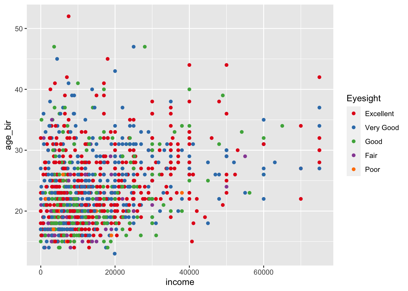
Then we replaced geom_point() with geom_jitter(). What did this do? Why might this be a good choice for this graph? Play with the width = and height = options within geom_jitter().
We used the shape = argument to map the sex variable to different shapes. We wanted to change the shapes to squares and diamonds. Let’s explore
ggplot(data = nlsy) +
geom_point(aes(x = income, y = age_bir), shape = sex)ggplot(data = nlsy) +
geom_point(aes(x = income, y = age_bir, shape = sex))
ggplot(data = nlsy) +
  geom_point(aes(x = income, y = age_bir, shape = factor(sex)))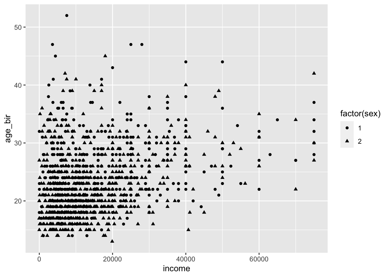
Now we can look at this site to see how to specify the values: https://ggplot2.tidyverse.org/articles/ggplot2-specs.html#sec:shape-spec
ggplot(data = nlsy) +
  geom_point(aes(x = income, y = age_bir, shape = factor(sex))) +
  scale_shape_manual(values = c("square", "diamond"))
ggplot(data = nlsy) +
  geom_point(aes(x = income, y = age_bir, shape = factor(sex))) +
  scale_shape_manual(values = c(15, 18))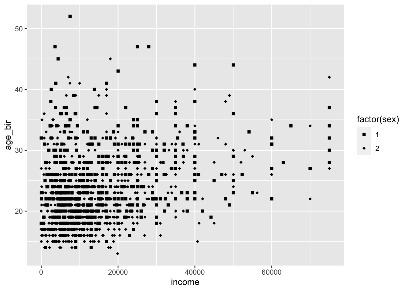
If we want them to match specific levels (remembering that sex just has two levels, 1 and 2), we can do so like this:
ggplot(data = nlsy) +
  geom_point(aes(x = income, y = age_bir, shape = factor(sex))) +
  scale_shape_manual(values = c("1" = "diamond", "2" = "square"))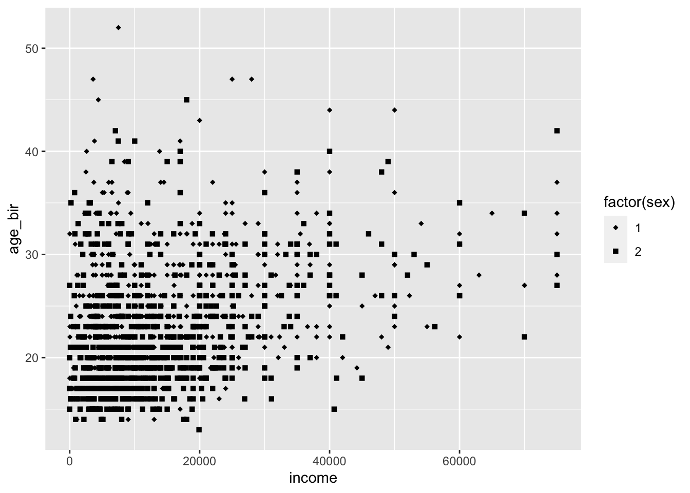
Any good creations built out of this exploration?
ggplot(data = nlsy) +
  geom_<>(aes(x = <>, y = <>, color = <>, ...), color = <>, ...) +
  scale_color_<>(name = <>, ...)
Facets
We saw that we can split up the graphs by category with the facet_ functions:
ggplot(data = nlsy) +
  geom_bar(aes(x = nsibs)) +
  labs(x = "Number of siblings") +
  facet_grid(cols = vars(region), rows = vars(glasses), scales = "free")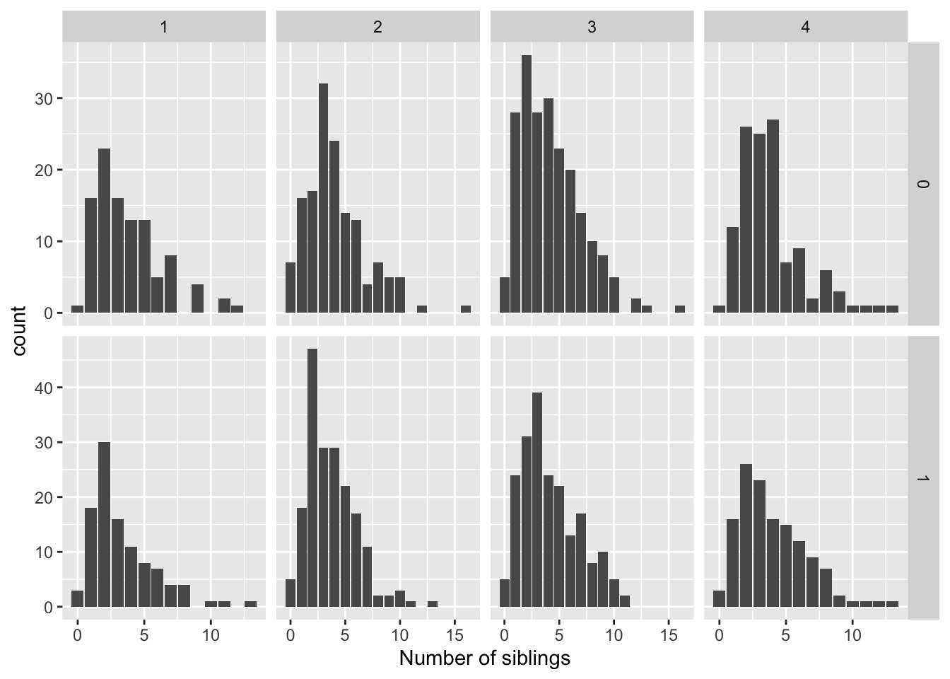
We can also put multiple variables along the rows and/or columns:
ggplot(data = nlsy) +
  geom_bar(aes(x = nsibs)) +
  labs(x = "Number of siblings") +
  facet_grid(rows = vars(region, glasses), scales = "free")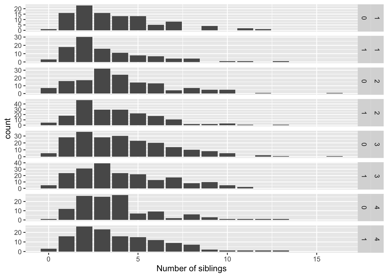
Since we haven’t assigned better labels to these categories, neither of these is very readable. We can use the labeller = argument to help. Its syntax is a bit confusing so I usually just copy and paste from the examples in the help or that I’ve figured out before!
ggplot(data = nlsy) +
  geom_bar(aes(x = nsibs)) +
  labs(x = "Number of siblings") +
  facet_grid(rows = vars(region, glasses), scales = "free",
             labeller = labeller(glasses = c("0" = "Doesn't wear glasses",
                                             "1" = "Wears glasses/contacts"),
                                 region = c("1" = "Northeast", "2" = "North Central",
                                            "3" = "South", "4" = "West")))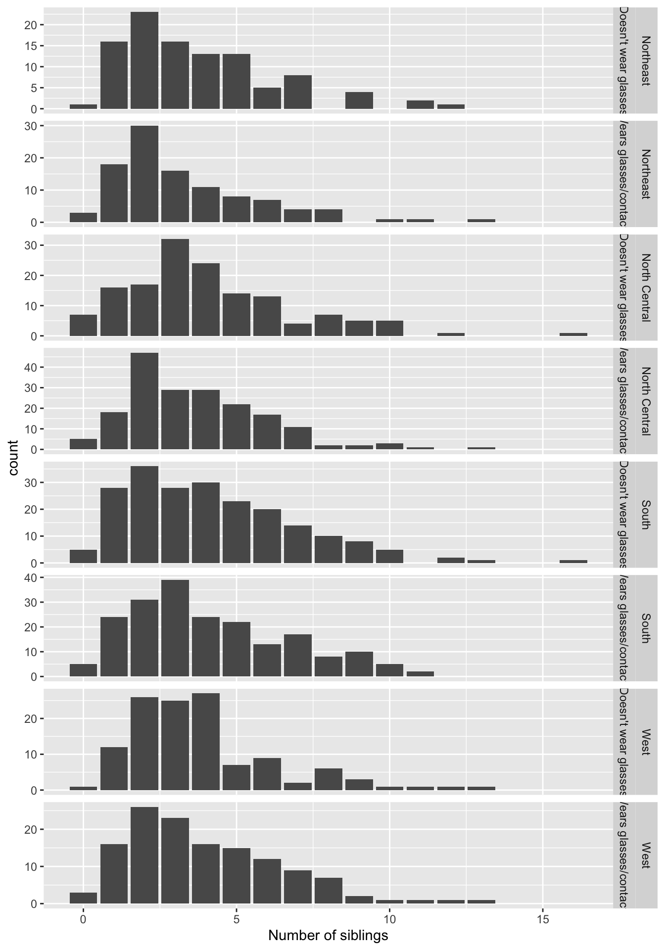
ggplot(data = nlsy) +
  geom_bar(aes(x = nsibs)) +
  labs(x = "Number of siblings") +
  facet_grid(rows = vars(region, glasses), scales = "free",
             labeller = label_both)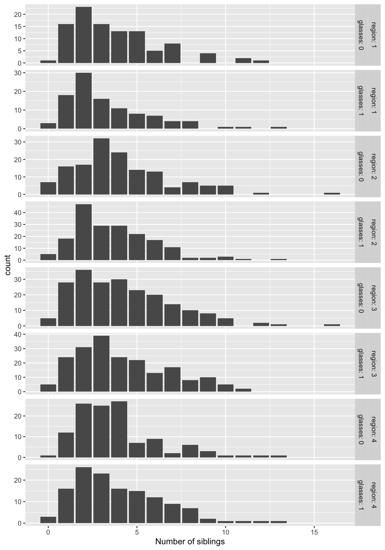
Histograms
We started with an example of a histogram for income:
ggplot(data = nlsy) +
  geom_histogram(aes(x = income), binwidth = 1000)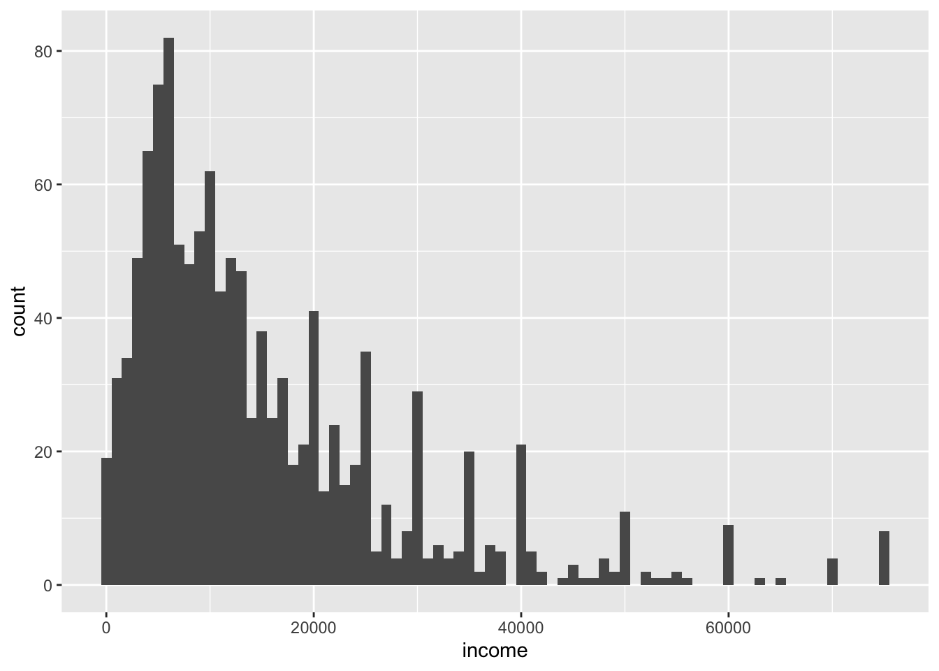
To make a density histogram, which scales the x-axis so the bins sum to 1, this is the method that the documentation currently suggests:
ggplot(data = nlsy) +
  geom_histogram(aes(x = income, after_stat(density)), binwidth = 1000)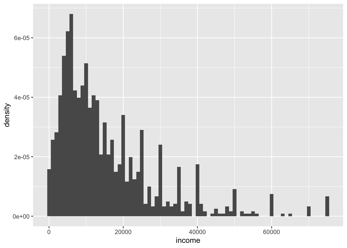
This can be useful to compare distributions, e.g., when facetting. Compare:
ggplot(data = nlsy) +
  geom_histogram(aes(x = income), binwidth = 1000) +
  facet_grid(cols = vars(region))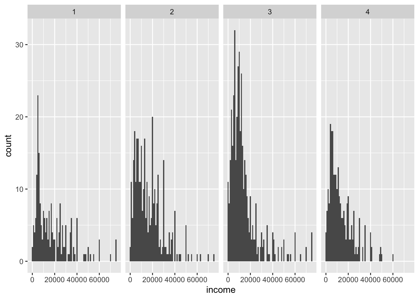
ggplot(data = nlsy) +
  geom_histogram(aes(x = income, after_stat(density)), binwidth = 1000) +
  facet_grid(cols = vars(region))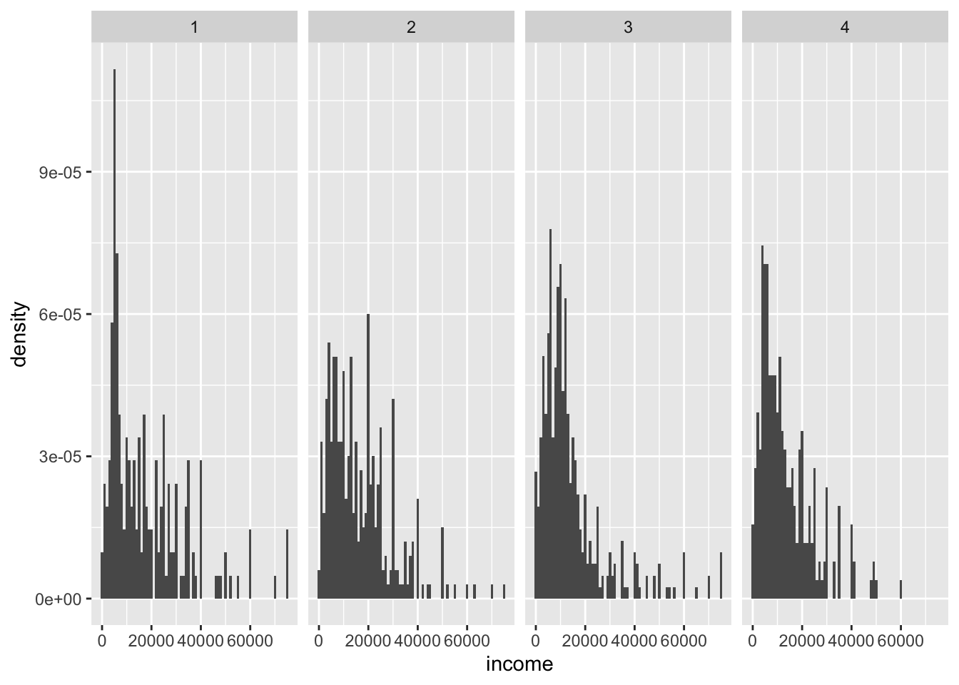
How would we color the histogram above?
And how would we transform the x-axis scale? And label that scale?
Perfecting and saving your work
Besides manually saving using the “Export” button in the “Plots” window, the ggsave() function is super useful for programmatically saving your figures.
plot1 <- ggplot(data = nlsy) +
  geom_histogram(aes(x = income), binwidth = 1000)
plot2 <- ggplot(data = nlsy) +
  geom_histogram(aes(x = income, after_stat(density)), binwidth = 1000)
ggsave("plot1.png", plot = plot1, height = 5, width = 8)
ggsave("plot2.pdf", plot = plot2, height = 6, width = 12)
Usually you want to perfect the formatting a bit more before saving, though. You could spend hours perfecting the theme yourself, or choose a built-in theme from ggplot2 or another package:
# install.packages("ggthemes")
ggplot(data = nlsy) +
  geom_histogram(aes(x = income), binwidth = 1000) +
  ggthemes::theme_solarized_2()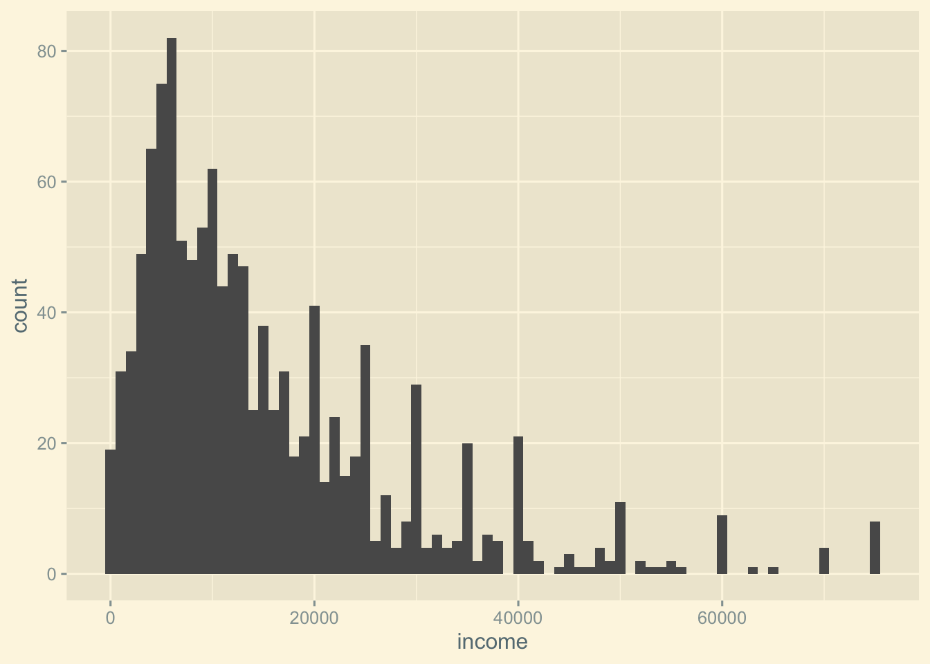
You probably also what to change the labels:
ggplot(data = nlsy) +
  geom_histogram(aes(x = income), binwidth = 1000) +
  labs(x = "Income in USD", y = "Count", title = "Income in NLSY", subtitle = "in 1979\nin a subset of participants")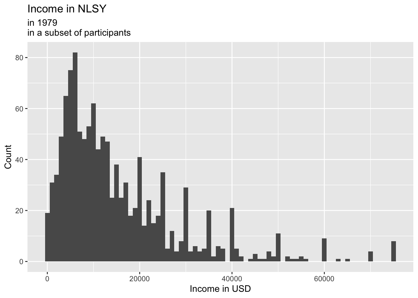
2.3 Challenge
We couldn’t possibly go over all there is to do in ggplot – it could take a semester. The best way to learn, once you have these basics down, is just to explore.
In your groups:
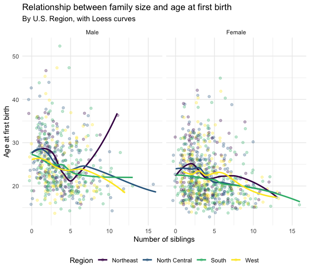
Try to recreate this figure:
Looking over the examples and options on this page, try to make the ugliest figure you can using the NLSY data.